


 Menu
Graphic Design Journal
Swell Smiles Pediatric Dentistry: A Fresh Approach to Branding and Logo Design in Jacksonville
The most successful brands are built around more than a memorable logo.
They begin with a meaningful story, a clear sense of purpose, and a visual identity that authentically represents the people behind the business. Our recent collaboration with Swell Smiles Pediatric Dentistry is a perfect example of how thoughtful naming, brand strategy, and logo design can come together to create something distinctive.
Swell Smiles is an exciting new pediatric dental practice coming to Jacksonville, Florida, in early 2027. Founded by Jacksonville native and board-certified pediatric dentist Dr. Noah Andone, the practice is built around a refreshingly simple philosophy: helping children feel comfortable, confident, and genuinely excited about visiting the dentist. We were fortunate to partner with this wonderful local family to develop the business name and a comprehensive logo and brand identity package. Drawing inspiration from Jacksonville’s coastal culture, the family’s local roots, and their commitment to creating positive dental experiences, our goal was to establish a brand that feels approachable, timeless, and unmistakably connected to the First Coast. The result is Swell Smiles Pediatric Dentistry, a brand with a personality as welcoming as the practice itself.
Building a Different Kind of Pediatric Dental Experience
For many children, visiting the dentist can be an intimidating experience. Unfamiliar surroundings, new faces, and uncertainty about dental procedures often create anxiety long before an appointment begins. Swell Smiles is setting out to change that perception. As a father and experienced pediatric dentist, Dr. Noah Andone understands the importance of making healthcare experiences positive from an early age. His vision is to create a practice where children feel safe, families feel supported, and dental visits become something to look forward to rather than fear.
Unlike the increasingly corporate approach to healthcare, Swell Smiles is proudly independent and locally owned. The practice is deeply connected to Jacksonville and the families who call Northeast Florida home. Its approach also extends beyond traditional pediatric dental care. Swell Smiles is preparing a thoughtfully designed environment inspired by the Florida coast, with welcoming family spaces and accommodations for children with special healthcare needs. The practice plans to serve patients from newborns through their teenage years. Every element reflects the belief that a positive dental experience can help establish healthy habits that last a lifetime. This philosophy became the foundation of our creative direction. Rather than creating an identity that simply looked like another pediatric dental office, we wanted to capture the warmth, personality, and community-minded spirit behind the business.
Learn more about the practice at Swell Smiles Pediatric Dentistry.
The Naming Process: Finding the Perfect Fit
One of the most rewarding aspects of this project was being involved from the very beginning through a dedicated business naming exercise. Naming a new company is an important part of the brand development process. A strong name should be easy to remember, communicate the appropriate personality, differentiate the business from competitors, and provide opportunities for creative visual storytelling. For this project, we wanted to find a name that would feel natural to Jacksonville families while capturing the uplifting and approachable personality of the practice.
The name Swell Smiles brought these ideas together.
The word “swell” has a particularly fitting dual meaning. Historically, it has been used to describe something wonderful or excellent, communicating positivity and optimism. Within coastal and surfing culture, a swell refers to the ocean waves that define the experience of being in the water. Combined with “Smiles,” the name creates an immediate connection between healthy, happy children and Jacksonville’s beachside lifestyle. It’s short, memorable, and approachable without feeling overly juvenile. It also provides a distinctive foundation for a visual identity that can grow with the business. Most importantly, the name feels authentic to the people and place behind the practice. Jacksonville’s coastal culture isn’t simply a design trend here. It’s a meaningful part of the family’s story and the community they’re proud to serve.
Jacksonville Brand Identity Design Inspired by Coastal Culture
With the name established, our attention turned to creating a visual identity that could bring the Swell Smiles personality to life. The creative direction centered on a relaxed, vintage-inspired coastal aesthetic. We wanted the identity to feel playful enough to appeal to children while remaining sophisticated and professional enough to resonate with parents. This balance is particularly important in pediatric healthcare branding. While bright colors, cartoon characters, and exaggerated graphics can feel appropriate for children, they don’t always communicate the trust and credibility that parents expect from a healthcare provider.
Our approach was to develop a brand that felt fun without being childish, nostalgic without appearing outdated, and coastal without relying on predictable beach-themed design conventions. The resulting identity combines expressive typography, custom surf-inspired illustration, a restrained color palette, and a flexible family of supporting logo elements. Through our Jacksonville brand development services, we focus on creating cohesive visual systems that represent the unique personality of each business. Swell Smiles provided an ideal opportunity to demonstrate how a carefully considered concept can inform every detail of a brand.
The Logo Design: Vintage Inspiration Meets Modern Personality
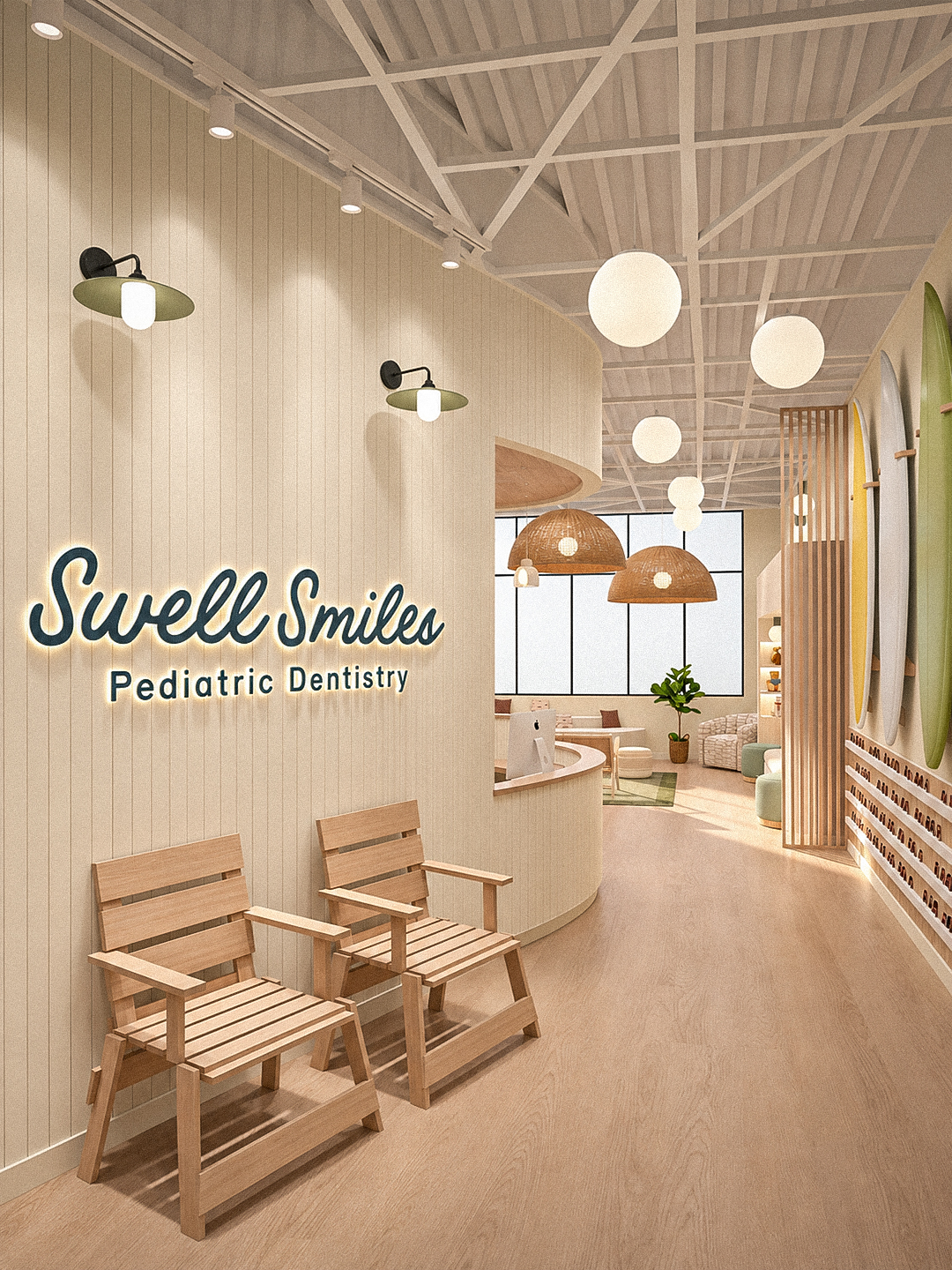
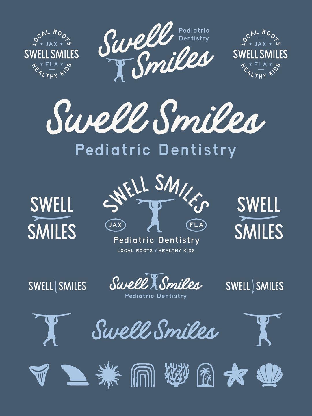
The Swell Smiles logo is built around an expressive script wordmark that serves as the central element of the visual identity. Its flowing letterforms communicate movement, energy, and personality, drawing inspiration from classic American lettering and vintage surf culture. The typography has a familiar, nostalgic quality that feels welcoming and authentic, while its confident form provides a distinctive and recognizable signature for the business. The natural movement of the script also creates a subtle visual relationship with the rolling motion of ocean waves, reinforcing the coastal inspiration behind the name.
Complementing the script is a family of secondary typography treatments featuring condensed, hand-lettered-style forms and more structured sans-serif lettering. These contrasting typographic styles create a versatile system. The script establishes the personality of the brand, while the supporting letterforms provide clarity, balance, and flexibility across different applications.
A particularly distinctive element of the logo system is the illustrated surfer carrying a surfboard overhead. This simple silhouette reinforces the First Coast connection and introduces an unmistakably human element to the identity. The figure provides a playful visual signature that can function alongside the primary wordmark or independently as a recognizable brand asset.
The design is supported by additional coastal illustrations, including surf fins, shark teeth, coral, seashells, starfish, and other beach-inspired elements. Together, these details build a visual vocabulary that extends well beyond a single logo. Our approach to professional logo design in Jacksonville emphasizes this kind of flexibility. A successful identity should work across numerous formats and environments while maintaining consistency and recognition.
A Coastal Color Palette with Timeless Appeal
Color plays an important role in establishing the emotional tone of a brand, particularly one focused on children and families. For Swell Smiles, we developed a restrained palette of muted slate blue, soft coastal blue, and warm off-white. The deeper blue establishes confidence, stability, and professionalism. It provides a strong foundation for the primary wordmark and supporting typography while communicating the trust associated with quality healthcare. The lighter blue introduces an approachable, airy quality reminiscent of clear coastal skies and the softer colors of the shoreline. Warm off-white creates contrast and helps the overall identity feel relaxed, inviting, and natural.
Rather than relying on the saturated primary colors commonly associated with pediatric branding, this palette offers a more timeless and sophisticated interpretation of a family-friendly visual identity. The colors also allow the logo and supporting illustrations to work beautifully in both light and dark configurations, providing practical versatility for printed materials, environmental graphics, apparel, and digital applications.
Creating a Flexible Logo and Brand Package
Businesses need visual assets that perform consistently across different sizes, proportions, backgrounds, and uses. A primary logo may work beautifully on a website or storefront, but that same arrangement isn’t always ideal for social media, promotional merchandise, or smaller printed materials. For Swell Smiles, we developed a comprehensive family of complementary logo configurations. The system includes a prominent horizontal wordmark, stacked logo arrangements, circular badge designs, typography-driven variations, and standalone illustrated elements. The circular badge treatment incorporates the practice’s connection to Jacksonville through references to local roots, healthy kids, and JAX, FL. It gives the identity a community-oriented, heritage-inspired quality that feels especially appropriate for the brand.
The secondary logos also create opportunities for expressive applications without sacrificing consistency. Whether the identity appears on a large interior wall, a staff shirt, a piece of stationery, or an Instagram graphic, the visual language remains recognizable. This versatility is an important component of our broader graphic design services in Jacksonville. We approach each identity as a functional design system rather than an isolated piece of artwork.
Bringing the Brand into the Physical Environment
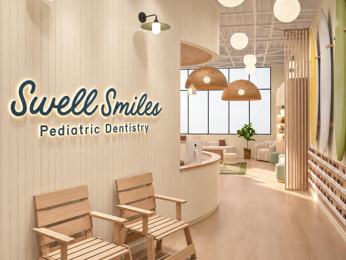
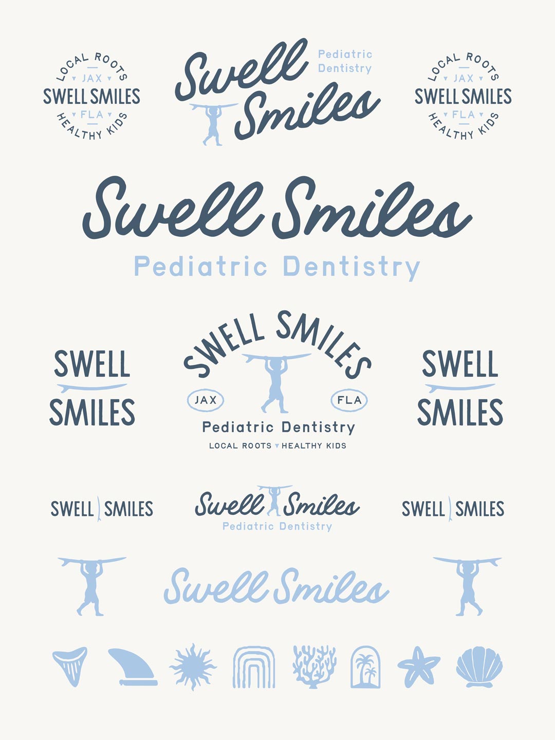
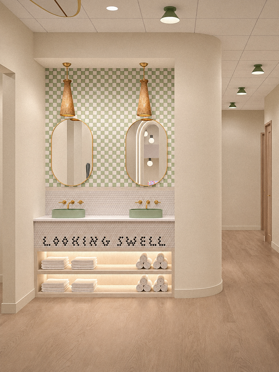
One of the most exciting aspects of the Swell Smiles project is seeing how the brand identity complements the vision for the practice’s physical environment. The interior renderings reveal a warm, welcoming coastal atmosphere, incorporating natural wood, soft neutral finishes, woven textures, surfboards, and thoughtful architectural details. The Swell Smiles wordmark appears prominently within the planned reception space, creating a natural connection between the brand’s visual personality and the overall patient experience. These environmental details reinforce what the identity communicates: this isn’t intended to feel like an ordinary dental office.
The calming materials, approachable graphics, and relaxed beach-inspired atmosphere support the practice’s mission of making children and families feel comfortable. Although our role focused on the business naming and logo brand package rather than the interior design itself, it’s rewarding to see the identity finding a natural home within the larger creative vision. A well-developed brand should extend beyond marketing materials and become part of how people experience a business. Swell Smiles is an excellent example of that opportunity.
Celebrating Local Roots and a Family-Owned Business
Perhaps the most meaningful part of this collaboration has been working with the family behind Swell Smiles. As a locally owned creative studio, we appreciate the entrepreneurial commitment required to establish a new business, especially one founded on the desire to serve families and make a positive impact within the community. Dr. Noah and his family are building more than a pediatric dental practice. They’re creating something personal, with a thoughtful approach to patient care and a genuine connection to Jacksonville. It was an absolute pleasure collaborating with them throughout the naming and brand identity development process.
Projects like this remind us why we love what we do. Having the opportunity to help an ambitious new business establish its identity from the beginning is both creatively rewarding and personally meaningful. We’re incredibly excited to see Swell Smiles become part of Jacksonville’s business community and look forward to watching the practice grow.
Congratulations to the entire Swell Smiles family on this exciting new chapter!
You can follow their journey and get updates on the upcoming opening by connecting with @swellsmiles on Instagram.
Looking for Branding and Logo Design in Jacksonville?
We’re passionate about helping businesses develop memorable, meaningful visual identities that reflect who they are and what makes them unique. From initial business naming and brand strategy to logo design and comprehensive identity development, our goal is to create thoughtful work that supports long-term brand recognition and growth. Whether you’re launching a new company, refreshing an established business, or building a brand from the ground up, we’d love to hear what you have in mind.
Contact 63 Visual to discuss your project, or request a branding and logo design quote to get started.
Great brands begin with great ideas. We’d love to help bring yours to life.

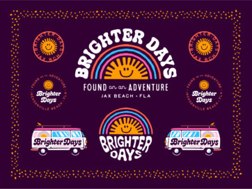
Vintage-Inspired Logo Design and Brand Identity
For Brighter Days, a colorful lifestyle boutique concept in Jacksonville Beach, Florida, the objective was to create an identity inspired by vintage aesthetics, playful typography, and the easygoing spirit of coastal living. At 63 Visual Design Company, we developed a…

Creative Director Patrick Carter Appears on The Deeply Graphic Designcast
For designers, creative business owners, and anyone interested in the business behind the work, the episode offers a look at how experience changes your approach to clients, projects, and long-term success. Listen to Patrick Carter on The Deeply Graphic Designcast…
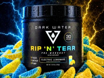
Dark Water Supplements Brand Development and Package Design
Consumers are presented with thousands of products making similar promises, often displayed through packaging filled with aggressive typography, exaggerated graphics and an overwhelming amount of information. For a new supplement company, creating an effective product is only part of the…
GET IN TOUCH
GET IN TOUCH

Let’s Work Together
63 Visual Design Company
602 Shetter Avenue
Jacksonville Beach, Florida 32250
833.630.6363
info@63visual.com
