


 Menu
Graphic Design Journal
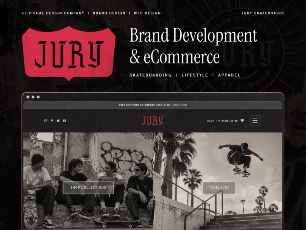
Skateboard Brand Design & eCommerce Website Design and Development
Skateboarding is about a culture built around individuality, creativity, personal expression, and a willingness to do things differently. Those same qualities make brand development for skateboarding companies, surf brands, and lifestyle apparel businesses a unique design challenge.
At 63 Visual, we approach branding for the surf, skate, and board sports industries with an understanding that a brand needs to feel like it belongs to the culture it represents. From custom typography and logo design to apparel graphics and eCommerce websites, every element should contribute to a recognizable and consistent identity. Our work for JURY Skateboards is an example of that approach. Although the company never officially made it to market, the project resulted in a complete creative direction that we’re sharing as part of our design portfolio.
JURY Skateboards: A Brand Built Around Individuality
The concept behind JURY Skateboards centered on a simple statement: “Judge Not Lest Ye Be Judged.”
Skateboarding has never been particularly interested in following conventional rules. It’s a culture where personal style matters, originality is respected, and progression often comes from taking risks. JURY was developed around that mindset, encouraging skateboarders to focus less on outside opinions and more on their own experiences. The supporting phrase, “Only Dog Can Judge,” added an irreverent personality to the brand while creating opportunities for graphic treatments across merchandise, apparel, and promotional materials. Our objective was to develop a visual identity that felt authentic to skateboarding without relying entirely on the familiar graphics and conventions associated with the industry.
Developing a Distinctive Skateboard Brand Identity
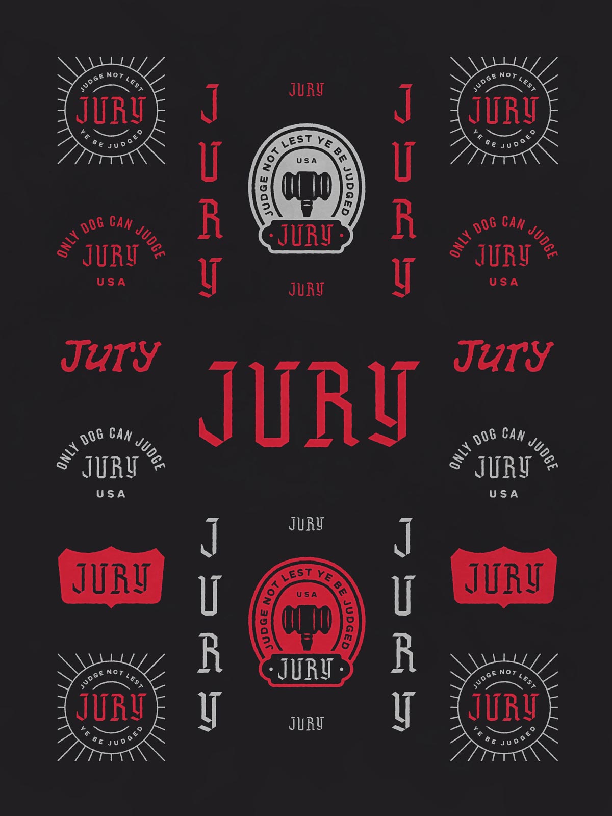
Successful skateboard brand design requires more than a recognizable logo. The identity needs to work across a variety of applications, from skateboard decks and apparel to product packaging, social media, and digital storefronts. For JURY, we developed a flexible logo system featuring custom letterforms, alternate wordmarks, badges, and supporting emblems.
Custom Typography and Logo Design
The primary JURY wordmark uses angular, Gothic-inspired letterforms that reference traditional lettering while introducing a distinctive contemporary edge. Its sharp geometry gives the brand an assertive personality that works particularly well in the context of skateboarding and streetwear. We expanded the primary logo into a family of supporting marks, including vertical letter arrangements, shield-style graphics, circular emblems, and alternate typographic treatments. This approach creates flexibility without sacrificing brand recognition. A primary logo might work best on a website header, while a compact emblem may be more appropriate for a hat, woven label, skateboard graphic, or small apparel application.
A Visual Language Beyond the Logo
The broader identity incorporates distressed textures, high-contrast graphics, black-and-white photography, and a limited color palette built around charcoal, off-white, and red. These elements give JURY a consistent visual personality while allowing individual compositions to feel spontaneous and expressive. The result is a branding system that can extend across different applications without requiring the same logo treatment or graphic arrangement every time.
Lifestyle Apparel Branding for Skate and Surf Companies
For many skateboard and surf companies, apparel is an essential part of the business. T-shirts, hats, hoodies, and other merchandise give customers a way to connect with a brand beyond its primary products. That makes lifestyle apparel branding an important consideration during the initial identity development process. For JURY, we considered how the visual identity would translate to clothing and accessories from the beginning rather than treating merchandise as a separate design exercise.
Designing Graphics for Apparel Applications
The JURY logo system provides a range of options for apparel design, including bold front graphics, smaller chest emblems, sleeve treatments, and embroidered patches. The restrained color palette and strong letterforms make the identity particularly suitable for screen printing, embroidery, woven labels, and other common apparel production methods. Creating a coordinated family of marks also allows a brand to develop varied merchandise collections while maintaining a recognizable identity.
Building a Lifestyle Brand That Extends Beyond Skateboarding
The relationship between skateboarding, surfing, streetwear, music, and art has created significant crossover within the lifestyle apparel industry. A skateboard company may begin with a specific product or community, but its visual identity often needs to communicate a broader lifestyle. For JURY, the combination of expressive typography, vintage-inspired graphics, and contemporary skate photography was intended to create that versatility. The identity feels appropriate for skateboard products and skate apparel while offering opportunities for broader lifestyle merchandise and collaborations.
eCommerce Website Design for a Skateboarding Brand
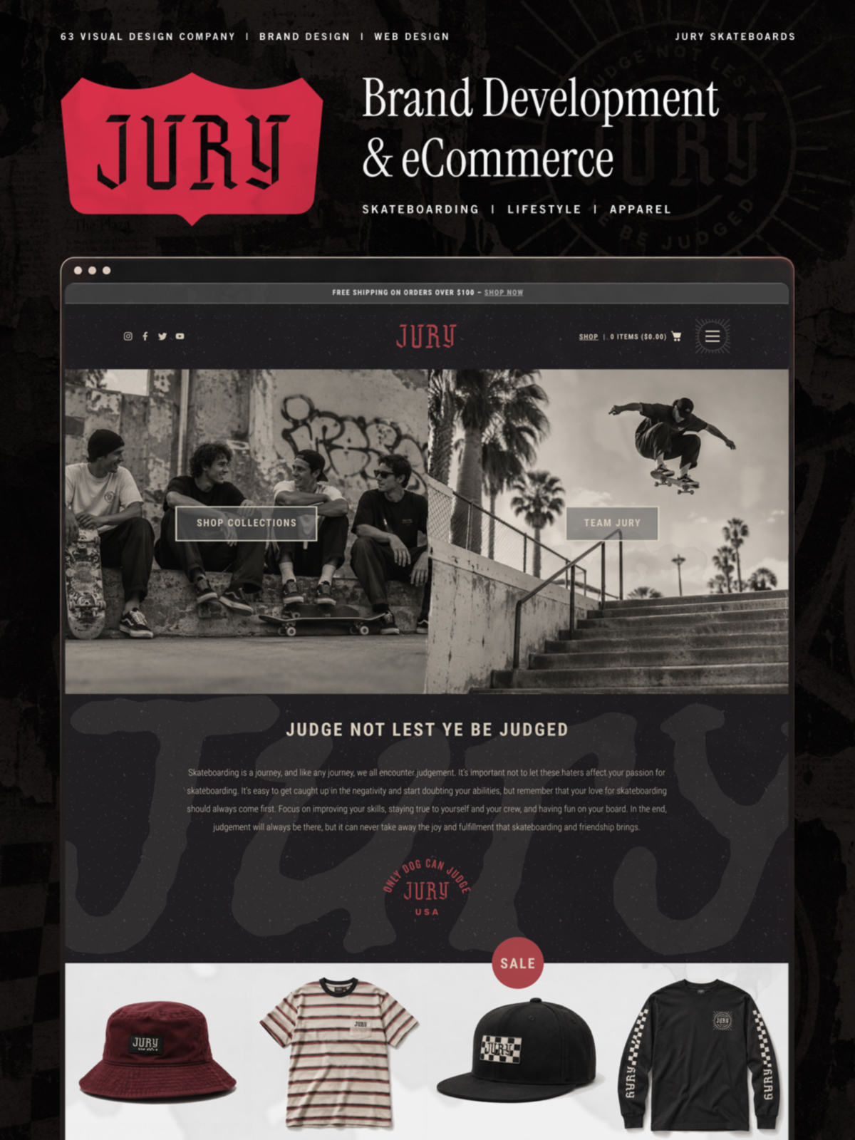
With the brand identity established, we extended the JURY visual system into a custom eCommerce website design. For lifestyle apparel and board sports companies, an online storefront needs to do more than display products. It should communicate the brand’s personality, introduce its culture, and create a straightforward shopping experience. The JURY homepage combines large-scale skateboarding photography, prominent calls to action, custom typography, and branded graphic textures to create an experience that feels connected to the identity.
Balancing Brand Expression and Usability
One of the challenges of eCommerce website design for creative lifestyle brands is balancing visual character with functionality. An overly conventional storefront can make a distinctive brand feel generic. On the other hand, excessive visual complexity can make it difficult for visitors to navigate collections or find products. Our design for JURY established a clear hierarchy between the brand story, product collections, apparel imagery, and shopping actions. The homepage incorporates a split photographic feature, a brand introduction, featured merchandise, and additional pathways into the company’s skateboarding content and collections. Dark textured backgrounds, custom graphics, and contrasting product areas help maintain the brand’s visual personality while separating the different functions of the page.
Connecting Brand Identity to the Shopping Experience
A cohesive eCommerce experience uses the same visual language established during brand development. For JURY, the typography, color palette, supporting graphics, and photographic direction carry through from the identity system into the website. This consistency is especially valuable for apparel and lifestyle businesses, where customers may encounter the brand through social media, clothing, printed materials, or its online store. Each interaction should feel like part of the same company.
Brand Design for the Surf, Skate, and Board Sports Industries
Although every business has its own audience and objectives, skateboarding companies, surf brands, and other board sports businesses share certain branding considerations. These industries have strong visual histories and established cultures. Customers are often familiar with the products, personalities, and design conventions associated with their favorite brands. Developing a successful identity means understanding those references while finding a distinctive direction for the individual company.
Why Authenticity Matters in Action Sports Branding
Skate and surf audiences tend to recognize when a brand’s presentation feels disconnected from the culture it claims to represent. Photography, typography, apparel graphics, and brand messaging should reflect a consistent point of view rather than simply adopting visual trends. For some companies, that might mean a clean, technical identity focused on performance. For others, it may involve hand-drawn illustration, vintage references, unconventional typography, or a more expressive graphic language. The right direction depends on the brand’s personality, products, and audience.
Creating a Flexible Identity for Multiple Products
Board sports companies frequently operate across several product categories, including equipment, apparel, accessories, and lifestyle merchandise. A flexible brand identity makes it easier to maintain visual consistency as those offerings expand. Developing primary and secondary logos, typography standards, color systems, apparel graphics, and digital design elements together creates a stronger foundation than approaching each application independently.
A Skateboard Branding Project That Never Made It to Market
Not every creative project ultimately becomes a commercial product. JURY Skateboards was developed through the brand identity and eCommerce design stages, but the company never officially launched. Despite that outcome, the project represents a substantial amount of creative exploration and design development. The identity system, apparel concepts, and website design remain examples of how a distinctive visual direction can be developed for a skateboarding and lifestyle apparel brand. Rather than leave the work in the archives, we’re sharing it as a case study. Sometimes a project’s commercial future changes, but the thinking and craftsmanship behind the design are still worth showing.
Brand Identity, Apparel Design & eCommerce Development by 63 Visual
63 Visual is a Jacksonville Beach, Florida-based design company specializing in brand identity, graphic design, and website design and development. Our work includes custom logo design, comprehensive brand identity systems, apparel graphics, packaging, and WordPress website development for businesses across a variety of industries.
For skateboard companies, surf brands, lifestyle apparel businesses, and other board sports organizations, we bring these disciplines together to create recognizable identities and cohesive digital experiences. Whether you’re launching a new lifestyle brand, developing an apparel collection, or updating the online presence of an established company, thoughtful branding helps create a consistent experience across every customer touchpoint.
Explore more of our work or contact 63 Visual to discuss your next brand identity or website design project.

OCDBees Brand Identity: Custom Logo Design for a Smarter Project Management Tool
At 63 Visual Design Company, we recently had the opportunity to develop the logo and visual brand identity for OCDBees, creating a cohesive design system built around a clever interpretation of the beehive, customized typography, and a distinctive honey-inspired color…
Retail Wellness Product Branding and Logo Design: A New Approach to Natural Relaxation
At 63 Visual, we approach retail wellness product branding with the understanding that a successful product needs more than an attractive logo. It needs a clearly defined personality, a compelling story, and a cohesive visual identity that connects with its…

Swell Smiles Pediatric Dentistry: A Fresh Approach to Branding and Logo Design in Jacksonville
They begin with a meaningful story, a clear sense of purpose, and a visual identity that authentically represents the people behind the business. Our recent collaboration with Swell Smiles Pediatric Dentistry is a perfect example of how thoughtful naming, brand…
GET IN TOUCH
GET IN TOUCH

Let’s Work Together
63 Visual Design Company
602 Shetter Avenue
Jacksonville Beach, Florida 32250
833.630.6363
info@63visual.com
