


 Menu
Graphic Design Journal
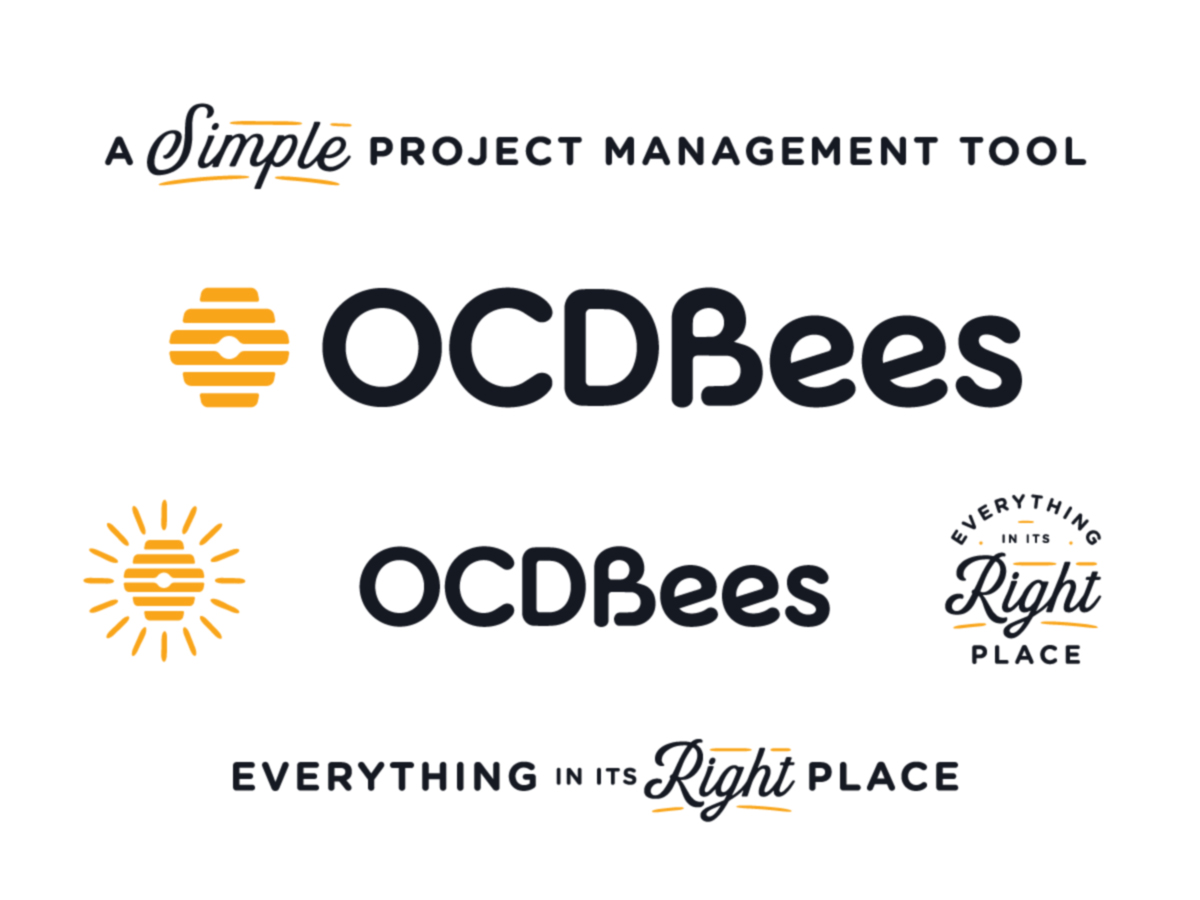
OCDBees Brand Identity: Custom Logo Design for a Smarter Project Management Tool
Great brand identity design starts with understanding what makes a business different and finding a way to communicate that distinction through a memorable visual experience. For OCDBees, a project management platform built around simplicity, organization, and efficiency, the challenge was to develop a brand that felt approachable, intelligent, and immediately recognizable
At 63 Visual Design Company, we recently had the opportunity to develop the logo and visual brand identity for OCDBees, creating a cohesive design system built around a clever interpretation of the beehive, customized typography, and a distinctive honey-inspired color palette.
We’re especially excited to congratulate the OCDBees team on the official launch of their brand at Adobe MAX in November 2026. It’s always rewarding to see a brand move from initial conversations and creative exploration into the real world, particularly when that introduction happens at an event celebrating creativity, technology, and design.
Understanding the Brand: A Simpler Approach to Project Management
OCDBees began with a straightforward observation: managing projects and tasks shouldn’t require unnecessarily complicated software.
The original concept grew out of a familiar workplace frustration. Keeping track of projects through handwritten lists and whiteboards can work temporarily, but as responsibilities grow, those systems become increasingly difficult to maintain. Information gets scattered, priorities change, and valuable time is spent organizing tasks instead of completing them. OCDBees was developed to provide a more efficient alternative: a functional, accessible list management and project organization tool.
Unlike software platforms attempting to combine customer relationship management, sales tracking, marketing automation, and countless other business functions into a single interface, OCDBees focuses on the essentials. Its purpose is to help users organize tasks, manage projects, and keep important information where it belongs. During our initial brand discovery process, several defining characteristics emerged: simplicity, organization, accessibility, and ease of use.
These ideas became the foundation of our creative direction. We wanted the visual identity to communicate functionality without feeling overly technical, and personality without compromising professionalism. The resulting brand captures that balance with two supporting messages: “A Simple Project Management Tool” and “Everything in Its Right Place.”
The Beehive Concept: Turning Organization Into a Visual Identity
One of the most interesting elements of the OCDBees project was the opportunity to build a logo around an instantly recognizable symbol with a direct connection to the company’s purpose. The beehive provided a natural starting point. Bees are associated with productivity, organization, cooperation, and efficiency. Within a hive, individual activities contribute to a larger, coordinated system. Those characteristics closely reflect the underlying philosophy of effective project management.
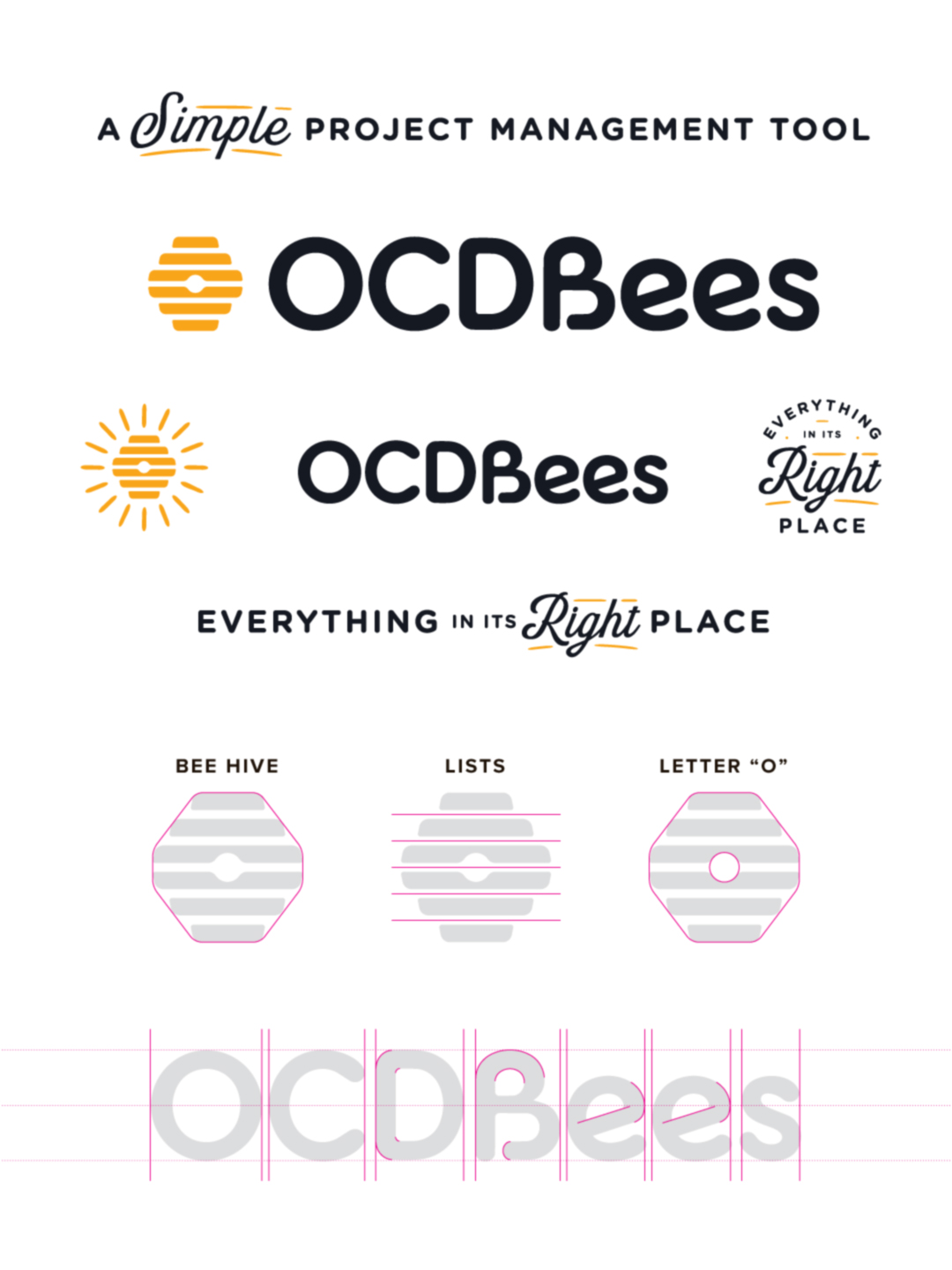
Rather than creating a literal illustration of a bee, we explored how the structure of a traditional beehive could be simplified into a modern, distinctive graphic symbol. The final icon uses a series of bold horizontal shapes that collectively form a recognizable hive silhouette. These stacked elements also suggest organized lists, creating a visual relationship between the company’s name and its software functionality. A central circular detail adds another point of interest, reinforcing the geometric structure while giving the symbol a recognizable visual signature.
This combination of concepts creates a logo that communicates on multiple levels. At first glance, it reads as a beehive. With closer consideration, the horizontal elements reveal their connection to task lists and organizational systems. That kind of visual storytelling is an important part of our approach to professional logo design. A strong identity doesn’t need to explain everything about a company, but it should communicate something meaningful about the business it represents.
Custom Logo Typography: Why a Wordmark Should Be More Than a Font
One of the defining characteristics of our Jacksonville Beach brand development studio is our commitment to customized typography. At 63 Visual, we believe a company’s logo should be more than its name typed in a commercially available font. Although existing typefaces can provide an excellent foundation, creating a memorable logotype requires additional consideration. Letterforms, proportions, spacing, curves, and individual typographic details all influence how a brand is perceived.
For OCDBees, we developed a customized wordmark featuring bold, rounded letterforms that complement the geometric simplicity of the hive icon. The letterforms have a friendly, contemporary appearance that feels appropriate for a modern software platform. Their substantial weight provides strong visibility, while the softened edges help the identity feel accessible rather than rigid or overly corporate. Particular attention was given to the relationship between the individual characters, including the more expressive forms within the “Bees” portion of the name. The resulting typography has its own visual rhythm and personality, allowing the wordmark to function as an independent brand asset.
Customizing typography also creates greater consistency between the symbol and the company name. Instead of treating the icon and wordmark as unrelated elements, we develop them as parts of one cohesive visual identity. This is a distinction we emphasize throughout our logo design process. The goal is not simply to select an attractive font. It is to create a recognizable typographic signature that belongs to the brand.
Combining the Beehive, Lists, and Letterforms Into One Design System
The strongest logo concepts often reveal their effectiveness through the simplicity of their construction. With OCDBees, three individual ideas helped shape the overall identity: the recognizable beehive silhouette, the organized horizontal structures of task lists, and the visual relationship between the icon and customized lettering. Each element supports the others. The hive shape provides an immediate connection to the brand name. The horizontal bands introduce a functional connection to project organization. The customized wordmark reinforces the approachable nature of the platform while maintaining the visual weight necessary to balance the symbol.
The icon can also be separated from the typography without losing its identity, an especially useful characteristic for software branding. Digital products often require simplified visual assets for small applications. Browser favicons, mobile application icons, profile images, and interface elements may not have enough space to display a complete company name. By creating a distinctive standalone symbol alongside the primary horizontal logo, we established a flexible foundation for these applications. That flexibility is one of the primary advantages of developing a coordinated brand identity rather than a single isolated logo.
A Honey-Inspired Color Palette That Balances Energy and Simplicity
Color plays an important role in creating a recognizable brand, particularly in the competitive market for software and digital productivity tools. For OCDBees, the color direction developed naturally from the beehive concept. A vibrant golden-yellow serves as the primary accent color, immediately reinforcing the association with bees, honey, and the energy of a productive hive. We paired that warm accent with a deep, nearly black charcoal to establish contrast and visual balance. The resulting palette feels clean, contemporary, and confident without becoming unnecessarily complicated.
The contrast between these colors also provides practical advantages. The dark wordmark remains prominent against a light background, while the yellow symbol creates an easily identifiable visual anchor. For a project management tool, this approach is particularly appropriate. The identity needs to feel engaging and memorable while supporting a product experience centered on clarity and usability.
By keeping the core palette focused, the broader software interface also has room to incorporate additional functional colors for different tasks, categories, or status indicators without creating unnecessary visual competition.
Building a Flexible Brand Identity for SaaS and Digital Products
Developing an identity for a software-as-a-service platform introduces considerations that differ from traditional print-focused branding. A SaaS brand must often function across a wide variety of digital environments, including websites, software dashboards, mobile applications, onboarding materials, promotional graphics, and social media.
Successful SaaS logo design and brand identity development requires understanding how the visual elements will perform within these different contexts. For OCDBees, the identity system includes a primary horizontal logo, a secondary logo configuration, a standalone beehive symbol, supporting tagline treatments, and complementary graphic elements. The alternate beehive graphic incorporates radiating lines, providing a more expressive variation of the primary symbol. This treatment offers additional opportunities for promotional materials and brand communications while maintaining a clear connection to the core identity.
The brand also includes typographic treatments of the company’s messaging, most notably “Everything in Its Right Place.” Within these compositions, the word “Right” receives a more expressive script treatment, creating contrast against the surrounding uppercase lettering. Small yellow accent strokes bring visual continuity to the complete presentation.
These supporting elements allow the brand to communicate with variety while remaining visually consistent. Rather than relying on the same logo configuration for every situation, OCDBees has a collection of coordinated assets that can adapt to the requirements of different applications.
Everything in Its Right Place: Connecting Brand Messaging With Product Purpose
The language used to describe a business should reinforce the same ideas communicated through its visual design. For OCDBees, the message “Everything in Its Right Place” connects directly to the purpose of the software. Project management is fundamentally about maintaining organization. Tasks need to be identified, priorities established, and information presented in a way that allows people to work efficiently.
The tagline communicates that benefit in a concise, memorable way without relying on complicated technical terminology. It also complements the underlying visual concept. Just as the graphic elements within the beehive occupy a defined position, the software is designed around the idea of placing tasks and information into an organized system. The relationship between brand messaging and visual identity creates a more complete experience. Instead of developing a logo and selecting a tagline independently, the two work together to communicate a consistent idea.
This approach helps strengthen brand recognition and establishes a clearer understanding of what the company represents.
Strategic Brand Identity for Technology Startups
The technology industry is filled with products offering increasingly sophisticated features, integrations, and functionality. While those capabilities are important, they can also make it difficult for individual companies to communicate what makes their product different. For startups and emerging SaaS companies, professional brand identity design provides an opportunity to establish that distinction early. A thoughtfully developed visual identity can help a company appear more established, communicate its personality, and create consistency across customer touchpoints.
For OCDBees, the objective was never to create the appearance of a complicated enterprise software platform. The product’s greatest strength lies in its straightforward approach to project and task management. We wanted the brand to reflect that simplicity. The recognizable beehive, organized geometric elements, customized typography, and restrained color palette work together to communicate a product that is structured, approachable, and easy to understand.
Importantly, the identity was also developed with future applications in mind. As OCDBees continues introducing its product to new audiences, the visual system provides a consistent foundation for marketing, digital experiences, and brand recognition. Good branding is not simply about making something look attractive. It is about creating a visual system that supports how a business communicates, operates, and grows.
Celebrating the OCDBees Brand Launch at Adobe MAX
We are proud to see OCDBees introduce its new identity at Adobe MAX in November 2026. Launching a brand is an important milestone for any company. It represents the transition from early planning and creative development to a public-facing identity that customers and audiences can begin to recognize. For our team, seeing the complete OCDBees identity come together has been particularly rewarding because of how closely the final design connects to the original creative objectives.
What began as a conversation about lists, organization, accessibility, and the recognizable structure of a beehive developed into a distinctive visual language with a clear purpose. The finished brand balances simplicity with personality, allowing the company to communicate its approach to project management through a memorable logo and cohesive supporting graphics. Congratulations to the OCDBees team on this exciting milestone. We’re grateful for the opportunity to contribute to the development of the brand and look forward to seeing it grow.
Custom Logo Design and Brand Identity Development in Jacksonville, Florida
OCDBees is an example of the strategic approach we bring to every logo design and brand development project at 63 Visual. Based in Jacksonville Beach, Florida, our independent graphic design studio has specialized in visual brand development since 2010, working with businesses ranging from emerging startups to established companies across a variety of industries. Our work includes custom logo design, typography, brand identity systems, graphic design, packaging, illustration, and website development.
Whether we’re developing a technology brand, designing a visual identity for a new retail business, or refreshing an established company’s presentation, our approach begins with understanding what makes each organization unique. We believe effective logos should be distinctive, purposeful, and carefully crafted. That means thinking beyond a standard font selection or a generic graphic symbol to develop visual elements that are specific to the company they represent.
Every detail matters, from the structure of individual letterforms to the relationship between a logo and its supporting brand assets. For businesses investing in professional branding, that attention to detail helps create a more cohesive and recognizable identity. Explore another example of our approach in our Brighter Days custom logo and brand identity project, or browse our logo design and brand development portfolio highlights to see more of our work.
If your company is preparing to launch a new brand or considering a redesign of its existing identity, we’d welcome the opportunity to discuss your project.
Connect with 63 Visual Design Company to learn more about our Jacksonville logo design and visual brand development services.

Retail Wellness Product Branding and Logo Design: A New Approach to Natural Relaxation
At 63 Visual, we approach retail wellness product branding with the understanding that a successful product needs more than an attractive logo. It needs a clearly defined personality, a compelling story, and a cohesive visual identity that connects with its…

Swell Smiles Pediatric Dentistry: A Fresh Approach to Branding and Logo Design in Jacksonville
They begin with a meaningful story, a clear sense of purpose, and a visual identity that authentically represents the people behind the business. Our recent collaboration with Swell Smiles Pediatric Dentistry is a perfect example of how thoughtful naming, brand…
Vintage-Inspired Logo Design and Brand Identity
For Brighter Days, a colorful lifestyle boutique concept in Jacksonville Beach, Florida, the objective was to create an identity inspired by vintage aesthetics, playful typography, and the easygoing spirit of coastal living. At 63 Visual Design Company, we developed a…
GET IN TOUCH
GET IN TOUCH

Let’s Work Together
63 Visual Design Company
602 Shetter Avenue
Jacksonville Beach, Florida 32250
833.630.6363
info@63visual.com
