


 Menu
Graphic Design Journal
Vintage-Inspired Logo Design and Brand Identity
Creating a distinctive brand identity involves developing a visual language that communicates personality, connects with an audience, and provides consistency across every application.
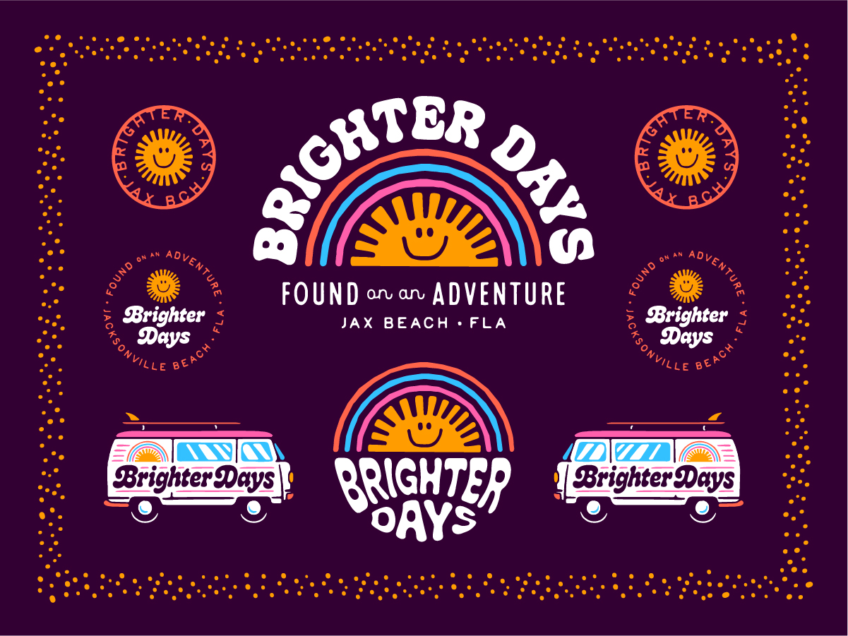
For Brighter Days, a colorful lifestyle boutique concept in Jacksonville Beach, Florida, the objective was to create an identity inspired by vintage aesthetics, playful typography, and the easygoing spirit of coastal living. At 63 Visual Design Company, we developed a comprehensive brand identity for Brighter Days that combines retro lettering, custom illustrations, a vibrant color palette, and a versatile collection of supporting graphics. The resulting design system draws inspiration from 1970s advertising, vintage surf and skate culture, and the expressive visual language of independent boutique brands. The project demonstrates how thoughtful logo design and brand development can translate an eclectic collection of creative influences into a cohesive, recognizable identity.
Developing a Distinctive Brand for Brighter Days
Brighter Days was conceived as a fun, unconventional lifestyle and retail concept with an emphasis on colorful merchandise, boutique products, and a welcoming, family-friendly atmosphere. The original creative direction called for an identity that was bright, happy, quirky, and full of personality. References included vintage beauty advertisements, nostalgic retail graphics, skateboard culture, and the playful energy of independent lifestyle brands. One of the more interesting aspects of the project was the desire to balance feminine aesthetics with a slightly grungy, tomboy-inspired sensibility. Rather than following conventional boutique branding trends, the direction called for something more expressive and unexpected.
From a design perspective, this created an opportunity to explore contrasting influences. Soft curves and playful colors could coexist with bold, unconventional lettering. Nostalgic illustrations could provide familiarity while still feeling relevant to a contemporary audience. Our objective was to establish a visual foundation that could support the personality of Brighter Days across its identity, storefront graphics, merchandise, packaging, and marketing materials.
Finding Inspiration in Vintage Typography and Retro Design
The creative process began by exploring visual references that reflected the personality of the business. Vintage advertising provided a particularly strong foundation. During the 1960s and 1970s, brands frequently relied on expressive typography, saturated colors, illustrated characters, and unconventional compositions to create memorable identities.
These influences remain relevant because they communicate personality in ways that more restrained, minimalist design systems sometimes cannot.
For Brighter Days, we explored several defining characteristics of this era:
- Bold, rounded lettering with irregular shapes and playful proportions.
- Sunshine and rainbow imagery associated with optimism and nostalgia.
- Bright colors reminiscent of vintage clothing, packaging, and advertising.
- Illustrated badges and decorative graphics inspired by retro merchandise.
- Casual, free-spirited visual references associated with surf and skate culture.
The challenge was to interpret these influences without creating an identity that felt dated or overly dependent on nostalgia. By combining vintage-inspired design elements with contemporary composition and application requirements, we developed a system intended to feel familiar, distinctive, and visually energetic.
Custom Logo Design with a Retro Personality
Typography plays a central role in the Brighter Days brand identity. The primary logo features expressive, rounded lettering inspired by vintage display typography. Its bold forms, flowing curves, and playful proportions establish a personality that is immediately recognizable. The design embraces the imperfections and exaggerated characteristics commonly associated with retro lettering. This approach reinforces the brand’s unconventional personality while making the name itself the centerpiece of the identity. An illustrated sunshine element is incorporated directly into the primary wordmark, creating a visual connection between the words “Brighter Days” and the optimistic imagery associated with the brand. The result is a logo with a strong visual presence that can function independently or alongside supporting illustrations and brand messaging. An important consideration throughout the process was versatility. The identity needed to accommodate both horizontal and vertically oriented formats, particularly for storefront signage and other applications with limited space. This requirement informed the development of multiple logo configurations within the finished system.
A Custom Sunshine and Rainbow Illustration
One of the most recognizable elements of the Brighter Days identity is its illustrated sunshine character. The graphic features a smiling sun with radiating rays, often positioned beneath a colorful rainbow. Its intentionally simple, friendly appearance references the cheerful illustrated characters found in vintage advertisements and merchandise. The illustration provides an accessible symbol that communicates the brand’s personality without requiring the full business name. This type of recognizable secondary icon can be particularly valuable for lifestyle and retail brands. Once established, a symbol can appear across a wide variety of applications while maintaining a consistent connection to the primary identity.
For Brighter Days, the sunshine illustration was designed to function in several ways. It appears integrated with the primary logo, centered beneath a rainbow, within circular badge graphics, and as an independent symbol. Each application offers a slightly different expression of the identity while maintaining visual consistency. The rainbow treatment introduces additional color and movement, reinforcing the retro influences that shaped the overall creative direction. Together, these elements establish a recognizable graphic vocabulary that extends well beyond a conventional logo.
Building a Vibrant and Memorable Color Palette
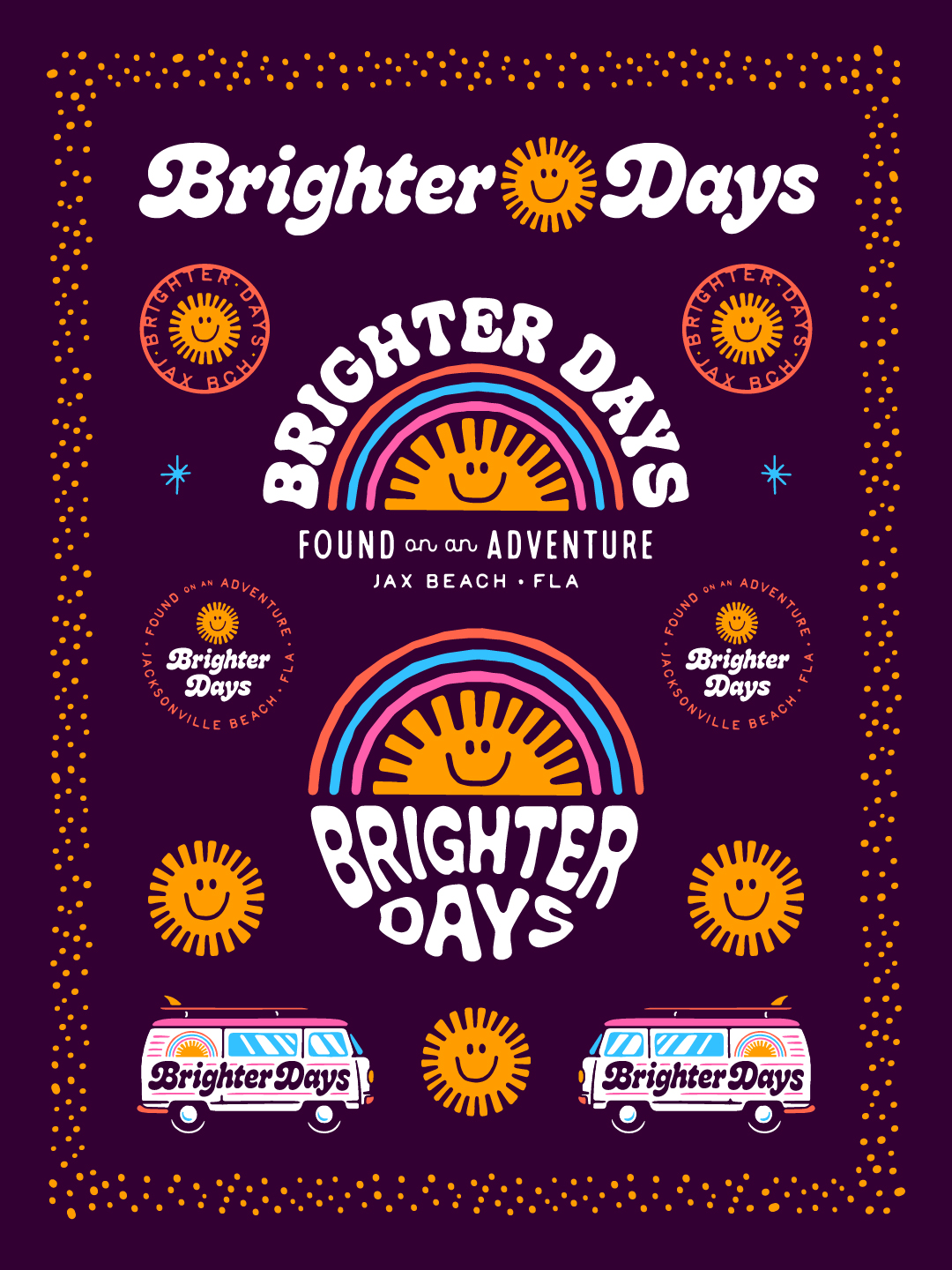
Color was a defining component of the Brighter Days brand development process. The original direction embraced bright, colorful design rather than a restrained or neutral palette. This created an opportunity to establish a distinctive combination of colors that would complement the vintage typography and illustrated graphics. The finished identity features a deep plum purple paired with warm golden yellow, coral, pink, and bright blue. Each color contributes to the overall personality of the brand. The plum provides contrast and visual depth, allowing the brighter colors to stand out. Golden yellow reinforces the sunshine imagery, while coral and pink introduce warmth and retro character. Blue adds a contrasting accent that gives the rainbow illustrations additional dimension.
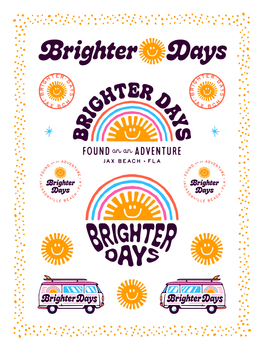
Equally important, the palette was developed to work across contrasting backgrounds. The brand system includes both dark and light presentations, demonstrating how the same collection of graphics can maintain its character in different environments. This flexibility is particularly useful for retail branding, where a visual identity may need to transition between storefront graphics, apparel, printed materials, product packaging, and digital marketing.
Designing a Complete Brand Identity System
At 63 Visual, our approach to brand identity development extends beyond producing a single primary logo. A recognizable brand benefits from having a collection of coordinated visual elements that can be adapted to different formats without sacrificing consistency.
For Brighter Days, the completed identity system includes:
- A primary horizontal wordmark with an integrated sunshine icon.
- Arched and stacked logo configurations.
- A custom sunshine and rainbow illustration.
- Circular badge designs and secondary brand marks.
- Location-based graphics referencing Jacksonville Beach, Florida.
- Supporting starbursts and decorative patterns.
- Vintage-inspired illustrated van graphics.
- Light and dark color variations.
These elements provide flexibility for a variety of creative applications. A circular badge might be used on a sticker, product label, or embroidered patch. A stacked logo can work particularly well on apparel, while a horizontal configuration is better suited for narrow signage. Supporting illustrations and decorative graphics allow the identity to appear in a broader range of compositions without repeating the same logo in every application. The goal is to create a consistent visual experience while allowing enough variety to keep the brand fresh and engaging.
Bringing the Identity into Retail and Merchandise Applications
Retail branding presents a unique set of design challenges. Unlike businesses that primarily rely on websites or traditional advertising, retail concepts often need their identities to function simultaneously as signage, packaging, environmental graphics, and merchandise. The original Brighter Days brief specifically identified a narrow storefront sign and front-window vinyl graphics as important applications. These practical requirements influenced how the logo system was developed. A wide wordmark accommodates horizontal signage, while compact iconography and secondary logo formats provide alternatives for smaller spaces.
The illustrated sunshine and rainbow graphics also lend themselves to apparel and promotional merchandise, where recognizable artwork can become an extension of the brand. Another distinctive element of the system is a pair of illustrated vintage vans featuring the Brighter Days name and related graphics. These illustrations reference the nostalgic, free-spirited atmosphere associated with coastal lifestyle branding. They also demonstrate how a brand’s identity can be expanded into decorative artwork without losing its established visual character. Whether used as standalone illustrations or integrated into promotional compositions, these graphics provide additional opportunities to communicate the brand’s personality.
Connecting the Brand to Jacksonville Beach
Location can play an important role in creating an authentic brand identity, especially for independent businesses with strong ties to their communities. Brighter Days incorporates Jacksonville Beach into its visual language through the location descriptor “Jax Beach • FLA” and supporting circular graphics. The phrase “Found on an Adventure” adds another layer of personality, complementing the sunshine, rainbow, and vintage-inspired imagery. These elements help position the brand within the casual, creative culture associated with Northeast Florida’s coastal communities. For a business based in Jacksonville Beach, establishing a recognizable connection to its location can also create opportunities for locally inspired merchandise and promotional materials. A brand identity that incorporates location thoughtfully can appeal to both residents and visitors without relying exclusively on traditional beach imagery. In the case of Brighter Days, the connection comes through its optimistic messaging, retro aesthetic, and relaxed personality.
Why Custom Branding Matters for Independent Retail Businesses
In a competitive retail environment, visual identity helps businesses communicate what makes them distinctive. A thoughtfully developed brand can shape first impressions, establish recognition, and provide consistency as a business expands its marketing efforts. For independent boutiques and lifestyle brands, this is particularly important because personality often plays a significant role in how customers perceive the business.
Custom typography, original illustrations, and coordinated supporting graphics allow a company to establish a recognizable appearance that differs from generic templates or commonly used design trends. A comprehensive identity system also creates practical advantages. Rather than redesigning graphics for each new application, businesses can draw from an established collection of visual assets. This simplifies future creative decisions and helps maintain consistency across different materials.
For Brighter Days, the completed system offers a flexible foundation for storefront graphics, print materials, apparel, product presentation, and digital content. The project illustrates how an identity can balance strong creative personality with the practical requirements of everyday business applications.
Jacksonville Logo Design and Brand Development by 63 Visual
Brighter Days is an example of the custom logo design and brand identity work we create at 63 Visual Design Company in Jacksonville Beach, Florida.
Founded in 2010, our independent graphic design studio specializes in logo design, brand development, custom illustration, packaging design, print design, and website development for businesses across Jacksonville, Northeast Florida, and beyond. Our approach focuses on understanding each brand’s personality, audience, and intended applications before developing a cohesive visual solution. Some projects require restrained, minimal identities. Others benefit from bold typography, colorful illustration, and expressive visual storytelling. The Brighter Days identity demonstrates the latter approach, combining vintage-inspired design influences with a flexible system of logos, illustrations, and supporting graphics. The result is a distinctive visual identity that reflects the personality of the concept while providing a practical foundation for future applications.
For more examples of our work, explore our Jacksonville graphic design and branding portfolio or learn more about our custom logo design services in Jacksonville.
Looking for a Jacksonville Logo Designer or Branding Studio?
Whether you’re launching a boutique, developing a retail brand, opening a restaurant, or refreshing an established business, 63 Visual can help create a visual identity tailored to your goals.
Visit 63 Visual Design Company to learn more about our branding services and discuss your next project.
You can also explore Brighter Days on Instagram at @brighterdaysjaxbeach.

Creative Director Patrick Carter Appears on The Deeply Graphic Designcast
For designers, creative business owners, and anyone interested in the business behind the work, the episode offers a look at how experience changes your approach to clients, projects, and long-term success. Listen to Patrick Carter on The Deeply Graphic Designcast…
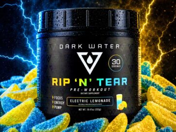
Dark Water Supplements Brand Development and Package Design
Consumers are presented with thousands of products making similar promises, often displayed through packaging filled with aggressive typography, exaggerated graphics and an overwhelming amount of information. For a new supplement company, creating an effective product is only part of the…
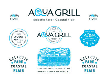
Aqua Grill Brand Exploration and Restaurant Merchandise Design
Located in Sawgrass Village in Ponte Vedra Beach, the restaurant has built a loyal following by offering an experience that feels polished without being overly formal. It is equally suited for a special evening out, a business dinner or a…
GET IN TOUCH
GET IN TOUCH

Let’s Work Together
63 Visual Design Company
602 Shetter Avenue
Jacksonville Beach, Florida 32250
833.630.6363
info@63visual.com
