


 Menu
MenuGraphic Design Journal
Dark Water Supplements Brand Development and Package Design
The nutritional supplement industry is one of the most competitive categories in modern retail.
Consumers are presented with thousands of products making similar promises, often displayed through packaging filled with aggressive typography, exaggerated graphics and an overwhelming amount of information.
For a new supplement company, creating an effective product is only part of the challenge. The brand must also earn attention, communicate credibility and give customers a compelling reason to choose it over an endless field of alternatives.
When Dark Water Supplements approached 63 Visual, the goal was to develop a complete identity that could bring a premium new health and wellness brand to market. Our work included brand development, logo design and nutritional supplement package design for the company’s flagship RIP ’N’ TEAR pre-workout product.
The result is a bold, focused brand that feels elite and performance-driven while remaining clean, modern and highly recognizable.
Building a Nutritional Supplement Brand That Can Cut Through the Noise
The nutritional supplement market is crowded with products competing for the same customers. Bright colors, oversized claims, flames, mascots, metallic effects and high-intensity graphics have become common throughout the category.
That visual competition creates a difficult branding problem. A package needs enough impact to stand out on a retail shelf or within a fast-moving social media feed, but adding more visual noise is not always the answer. When every competitor is shouting, a disciplined identity can become a more powerful way to command attention.
Our strategy for Dark Water Supplements was to create a premium visual system that felt strong without becoming chaotic. The identity needed to connect with serious athletes, weightlifters and fitness-minded consumers while presenting the company as a credible long-term brand rather than another temporary supplement product.
We built the design around a predominantly black visual foundation, controlled typography and carefully placed color. This gave the brand an elevated, almost tactical presence while allowing important product information and flavor distinctions to remain immediately visible.
Creating the Dark Water Supplements Brand Identity
The Dark Water Supplements identity began with the development of a distinctive symbol that could become the foundation of the entire brand.
The finished logo combines a strong geometric structure with a central water droplet. The outer shape creates a bold, angular mark that feels appropriate for a performance-focused company, while the droplet connects the identity directly to the Dark Water name.
The symbol was intentionally designed to function at a wide range of sizes. It can appear prominently on a supplement container, work as a social media profile image, be embroidered onto apparel or be reduced for small digital applications without losing its recognizable form.
That versatility is especially important for a growing health and wellness company. A successful identity cannot exist only on one product label. It needs to support packaging, merchandise, digital advertising, photography, web design and future product extensions.
The symbol was paired with a custom-feeling typographic treatment for the Dark Water name. The widely spaced lettering gives the identity a refined, technical character and creates contrast against the heavier typography used for the product name.
Together, these elements establish a visual hierarchy that is clear and confident. Dark Water is the master brand. RIP ’N’ TEAR is the product. The flavor, benefits, serving information and supporting details are organized beneath them in a way that is easy to understand.
This structured approach is central to effective professional logo design. The goal is not simply to create an attractive mark. The identity must provide a practical and recognizable foundation for every future brand touchpoint.
Premium Package Design for the Health and Wellness Industry
Package design plays a particularly important role in the nutritional supplement industry. Consumers frequently make decisions based on a combination of formula, perceived quality, visual presentation and trust.
The package must communicate energy and performance, but it must also feel organized and legitimate. If the label is confusing, difficult to read or visually inconsistent, it can undermine confidence before the customer ever studies the product itself.
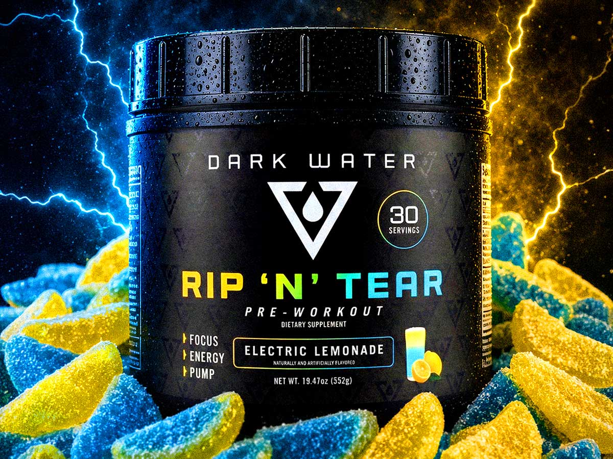
For the RIP ’N’ TEAR pre-workout container, we created a dark, sophisticated base that gives the package a premium presence. A subtle repeating pattern built from the Dark Water symbol adds depth without interfering with the primary information.
The central brand mark is large, bright and immediately visible. Beneath it, the RIP ’N’ TEAR product name uses a bold color transition that creates movement and energy while separating the product from the black background.
The front panel clearly presents the core information a customer needs:
- The Dark Water Supplements brand
- The RIP ’N’ TEAR product name
- The pre-workout product category
- The flavor designation
- Focus, energy and pump positioning
- Serving count and net weight
This information is given a deliberate hierarchy rather than being treated as a collection of competing elements. The customer can recognize the brand first, identify the product second and quickly locate the flavor and supporting details.
That balance between visual impact and communication is at the heart of effective package design. Packaging must attract attention, but it also needs to guide the customer through the information in the correct order.
A Flexible Package Design System for Multiple Flavors
One of the most important considerations in supplement package design is scalability. A successful product may launch with one formula or flavor, but the identity should be prepared to accommodate an expanding product line.
We created a consistent visual system for RIP ’N’ TEAR that allows each flavor to develop its own personality without weakening the master brand.
Electric Lemonade
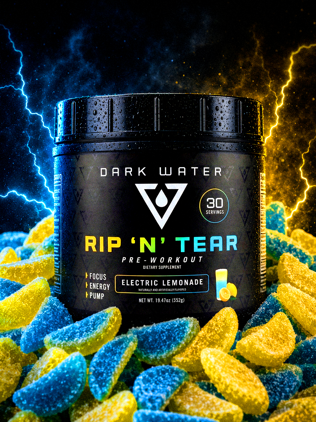
The Electric Lemonade package uses a yellow, green and blue color transition that communicates citrus flavor and electric energy. A small illustrated drink and lemon graphic provide a direct flavor cue while preserving the clean, high-end character of the overall design.
The supporting campaign imagery expands that visual language through blue and yellow sour lemon candies, dramatic lighting and controlled electrical effects. The photography feels energetic and intense, but the product remains centered, upright and dominant within the composition.
Sour Gummy Worm
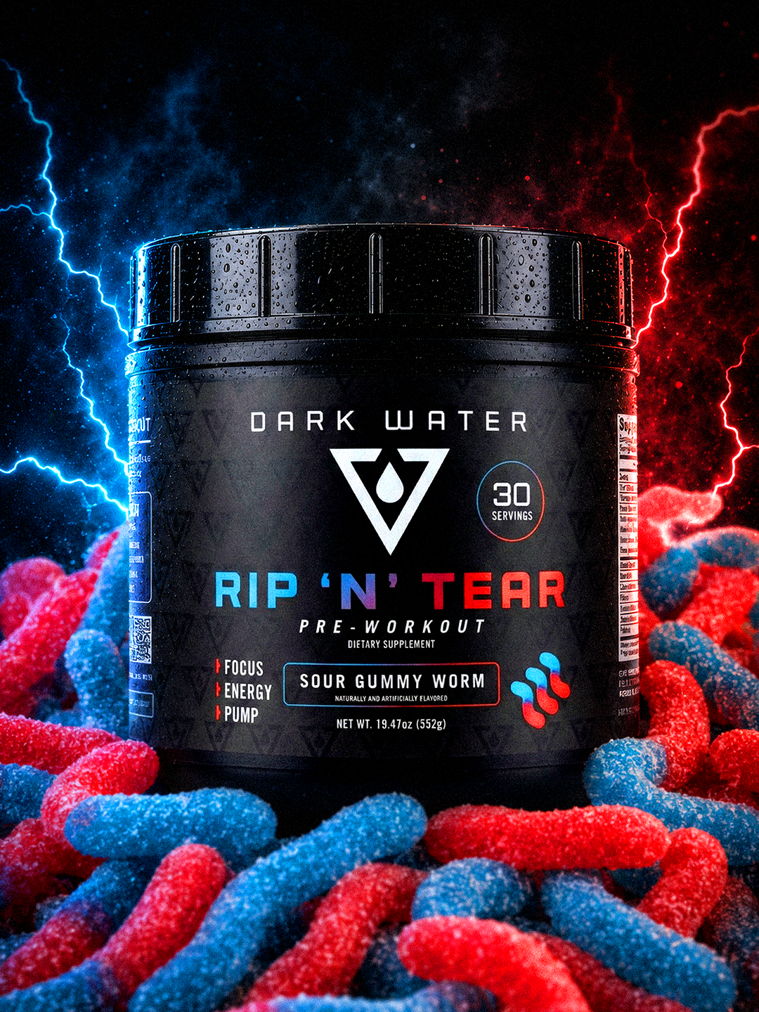
The Sour Gummy Worm variation shifts the color system toward electric blue, purple and red. The flavor icon and typography work together to distinguish it from Electric Lemonade while keeping the overall package unmistakably part of the same RIP ’N’ TEAR family.
Its promotional imagery uses red and blue sour gummy worms, corresponding lightning and the same dark atmospheric environment. The result provides a strong visual connection between the flavor, packaging and advertising campaign.
Maintaining this consistency is essential. Each flavor needs enough distinction to be quickly recognized, but customers should never question whether the products come from the same company.
Connecting Package Design to Product Positioning
RIP ’N’ TEAR is positioned as a pre-workout formula for customers seeking energy, focus, endurance and performance. Dark Water Supplements lists a formula that includes 250 milligrams of caffeine, 6 grams of L-citrulline malate, 3.2 grams of beta-alanine, 170 milligrams of L-theanine and 2.5 grams of betaine anhydrous.
The product is offered in Electric Lemonade and Sour Gummy Worm flavors, with 30 servings per container. Dark Water describes the formula as suitable for users ranging from beginners to advanced athletes, with an emphasis on energy, pump and workout performance.
Our design needed to visually support that positioning. The identity could not feel playful, generic or disconnected from the seriousness of the product. It needed to communicate intensity while retaining the clarity and polish associated with a premium health and wellness brand.
The combination of black packaging, disciplined typography, geometric forms and concentrated flavor colors creates that balance. The package feels powerful, but it does not depend on clutter or exaggerated imagery to earn attention.
Developing a Brand for Both Retail Shelves and Digital Commerce
Modern package design must perform in more environments than ever before. A nutritional supplement container may be viewed on a store shelf, but it is equally likely to be discovered through Instagram, an online advertisement, a mobile product page or an influencer’s video.
That means the design must remain recognizable even when displayed as a small thumbnail. The primary logo, product name and flavor colors need to communicate quickly without requiring the customer to study every detail.
The Dark Water system was created with this digital-first reality in mind. The white logo creates immediate contrast against the black container. The product name remains prominent, and each flavor has a recognizable color signature that can extend into photography, advertising and social content.
These campaign images demonstrate how a strong package can become the centerpiece of a broader visual world. The candy, lighting, atmosphere and electrical effects all reinforce the individual flavors, but the package remains the hero of the composition.
Customers can follow the growing brand and its product releases through @darkwatersupps.
Why Strategic Brand Development Matters in the Supplement Industry
A logo and label should never be treated as isolated pieces. The strongest consumer brands are built through a connected system in which identity, packaging, photography, messaging and digital presentation all support the same position.
For Dark Water Supplements, our objective was to build an identity capable of supporting more than a single pre-workout product. The brand needed enough character to be memorable, enough flexibility to expand and enough professionalism to earn consumer confidence.
That required thinking beyond decoration. We considered how the symbol would reproduce, how flavor variations would be organized, how the package would photograph, how the design would appear online and how the identity could extend into merchandise and future products.
This is the value of a comprehensive brand development process. Instead of solving each new application separately, the company receives a cohesive visual foundation that can guide future growth.
A Bold New Identity for Dark Water Supplements
The completed Dark Water Supplements identity and RIP ’N’ TEAR packaging create a distinctive presence within a crowded nutritional supplement market.
The brand feels premium, elite and performance-focused. The packaging is clean enough to communicate clearly but bold enough to cut through the noise on a retail shelf, product page or social media feed. Flavor-specific colors and campaign imagery add energy without compromising the strength of the core identity.
Most importantly, the system gives Dark Water Supplements a recognizable platform from which it can continue to grow.
Explore RIP ’N’ TEAR and learn more about the company at darkwatersupps.com.
Brand Identity and Package Design by 63 Visual
63 Visual works with emerging and established companies to create strategic brand identities, logos and packaging that help products compete in demanding markets.
Whether you are launching a nutritional supplement, developing a new health and wellness product or repositioning an existing consumer brand, thoughtful design can shape how customers understand and value what you offer.
Learn more about our logo design services, package design services and brand development capabilities.
Ready to develop a brand that stands out in the health and wellness marketplace? Request a project quote or contact 63 Visual to start the conversation.


Creative Director Patrick Carter Appears on The Deeply Graphic Designcast
For designers, creative business owners, and anyone interested in the business behind the work, the episode offers a look at how experience changes your approach to clients, projects, and long-term success. Listen to Patrick Carter on The Deeply Graphic Designcast…
Aqua Grill Brand Exploration and Restaurant Merchandise Design
Located in Sawgrass Village in Ponte Vedra Beach, the restaurant has built a loyal following by offering an experience that feels polished without being overly formal. It is equally suited for a special evening out, a business dinner or a…
How a Thoughtful Brand Identity Helped Gimme Wallpaper Showcase Its True Personality
It’s reflected in the way customers talk about the company, the quality of the work, and the experience they receive from the people behind the brand. Unfortunately, that personality doesn’t always come across in the visual identity. That’s where Gimme…
GET IN TOUCH
GET IN TOUCH

Let’s Work Together
63 Visual Design Company
602 Shetter Avenue
Jacksonville Beach, Florida 32250
833.630.6363
info@63visual.com
