 Menu
MenuGraphic Design Journal
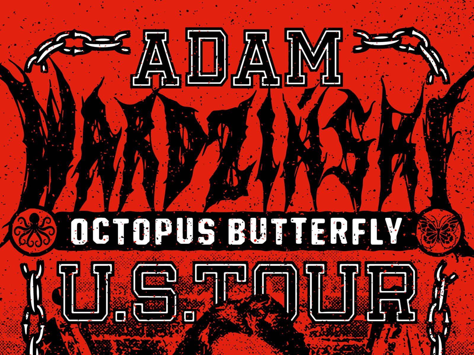
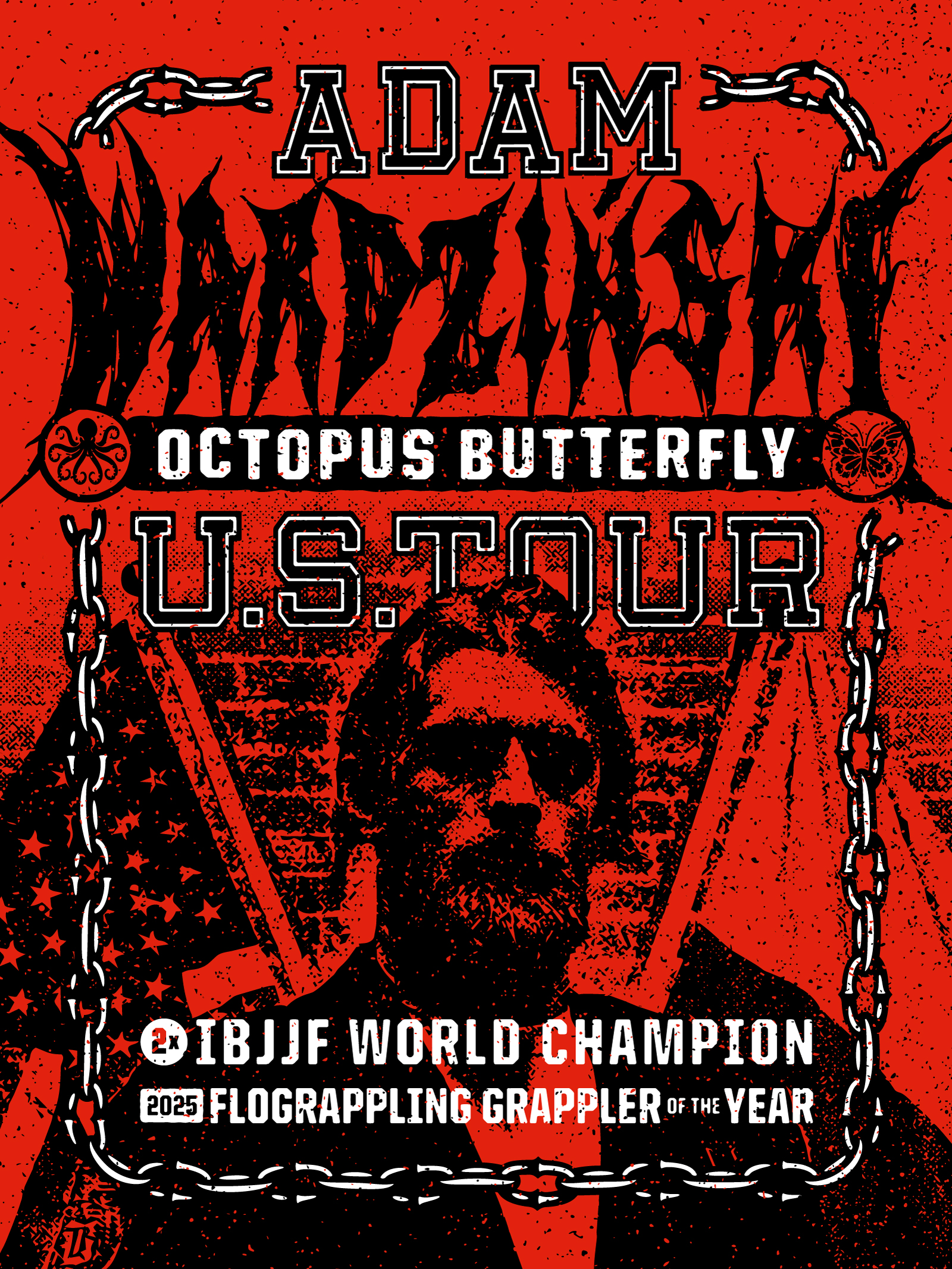
Brand Design for Adam Wardziński’s 2026 Octopus Butterfly U.S. Tour
At 63 Visual, we’re fortunate to work on projects across many industries, but every now and then, a collaboration comes along that hits on both a professional and personal level.
Working with Adam Wardziński (@wardziak_bjj) on the brand design for his 2026 Octopus Butterfly U.S. Tour was one of those moments.
As longtime fans of Adam’s jiu jitsu and his technical mastery of the butterfly guard, this project was already exciting. But having previously trained with him at a Rat Town Jiu Jitsu seminar in 2025 made the collaboration even more meaningful. Getting to work creatively with The Champ felt like a full-circle moment.
This was about honoring one of the most influential grapplers of this generation through bold, expressive visual impact.
Who Is Adam Wardziński?
If you train Brazilian Jiu Jitsu, Adam Wardziński needs no introduction.
Adam is a 2x IBJJF World Champion, 2025 FloGrappling Grappler of the Year, multiple-time European Champion, and Pan Champion. Beyond the medals, he’s widely regarded as the foremost name in modern jiu jitsu, redefining butterfly guard and pressure passing at the highest level of competition. His technical influence reaches gyms across the world. From elite competitors to everyday practitioners, Adam’s instructional content and competition performances have shaped how an entire generation approaches guard play. Simply put: Adam has evolved the sport.
Mat to the Studio: A Creative Partnership
Our connection with Adam began on the mats at Rat Town Jiu Jitsu, where we had the opportunity to attend one of his seminars last year. Anyone who’s trained with Adam knows his teaching style mirrors his competition approach: thoughtful, precise, and intentional. Those same qualities carried over into the design process. From day one, Adam was fully engaged creatively. He brought ideas, references, and clear vision while remaining open to exploration. That collaborative energy made it possible to build something authentic and rooted in who Adam is as both an athlete and a person.
The Concept: A Hardcore Tour Poster Meets World-Class Jiu Jitsu
One of the most interesting creative inputs came directly from Adam himself: he’s a huge fan of hardcore music and classic metal.
That detail immediately opened the door to something different.
Rather than approach this like a traditional martial arts promo, we leaned into a band tour poster aesthetic. Gritty, aggressive, and unapologetically bold. The goal was to create something that felt more like underground fight culture than polished sports marketing.
- Raw textures
- High-contrast imagery
- Heavy typography
- Stark compositions
- Punk-rock attitude
The Octopus Butterfly Tour branding was designed to feel like something you’d discover stapled to a telephone pole outside a music venue. Intense, mysterious, and impossible to ignore.
Punk Rock Production: Designed to Be Xeroxed
From a production standpoint, the core artwork was built as a three-color system: red, black, and white. That approach allows for clean reproduction across posters, apparel, social media, and event signage.
But we also designed the artwork with a secondary production technique in mind. The entire composition can be Xeroxed single-color black on red copy paper, a deliberate throwback to classic punk rock gig flyers. The kind of posters you’d see layered on brick walls or taped to streetlight poles. That gritty DIY culture aligns perfectly with jiu jitsu’s roots: underground, grassroots, built on community and passion rather than polish. It also gave the tour branding a timeless authenticity that feels earned instead of manufactured.
Visual Grit and Contrast
Stylistically, we leaned into distressed textures, heavy contrast, and stark compositions, drawing inspiration from classic metal flyers, hardcore album art, and Xerox zine culture. The portrait treatment uses crushed blacks and blown-out whites to create a near stencil-like effect. The chain framing reinforces the toughness of the sport, while the bold typography grounds the design in classic American tour poster traditions.
Every element serves a purpose:
- The octopus and butterfly references Adam’s signature guard system
- The red background signals intensity and urgency
- The distressed overlays add movement and aggression
- The structured layout keeps everything readable at distance
Designing for an Athlete Who Shapes the Sport
What made this project especially rewarding was knowing the person behind it. Adam is a competitor, a teacher, innovator, and ambassador for Brazilian Jiu Jitsu worldwide. His approach to the sport mirrors how we approach design: always evolving, always refining, always pushing forward. Creating branding for someone who operates at that level comes with responsibility. It has to feel authentic. It has to respect the discipline. And it has to carry weight.
We’re proud of what came together.
Looking Ahead: Rat Town Jiu Jitsu and the Octopus Butterfly U.S. Tour
The Octopus Butterfly U.S. Tour kicks off in one month and will be stopping in cities across the country. If Adam is coming to your area, don’t miss the opportunity to train with one of the greatest minds in modern grappling. We’re especially excited to welcome Adam back to Jacksonville for his upcoming visit to Rat Town Jiu Jitsu (@rat_town_jiujitsu) from May 8–10. Huge thanks to Adam Wardziński for trusting 63 Visual with this project and for being such an incredible collaborator from start to finish. Projects like this remind us why we love what we do.
About 63 Visual
63 Visual is a Jacksonville-based design studio specializing in brand identity, illustration, and visual storytelling for lifestyle brands, athletes, events, and businesses nationwide. Our work blends bold graphic design with authentic narrative, creating visuals that connect culture, community, and craft. Whether it’s combat sports, music, or business branding, we believe great design should feel raw, intentional, and unforgettable.

How a Thoughtful Brand Identity Helped Gimme Wallpaper Showcase Its True Personality
It’s reflected in the way customers talk about the company, the quality of the work, and the experience they receive from the people behind the brand. Unfortunately, that personality doesn’t always come across in the visual identity. That’s where Gimme…
Celebrating America 250: 63 Visual Designs a Patriotic Merchandise Collection for Pete’s Bar in Neptune Beach
If you know the Jacksonville Beaches, you know there is no place quite like it on the Fourth of July. Around here, you could call it the unofficial 4th of July Capital of the World. This year marks 250 years…
Brand Development for 5 Points Liquor Lounge in Jacksonville, Florida
When the team behind 5 Points Liquor Lounge set out to create a new bar in the historic 5 Points area of Jacksonville, Florida, the goal was to develop a brand that felt established, relaxed, and full of character from…
GET IN TOUCH
GET IN TOUCH

Let’s Work Together
63 Visual Design Company
602 Shetter Avenue
Jacksonville Beach, Florida 32250
833.630.6363
info@63visual.com