 Menu
MenuGraphic Design Journal
Branding Celestine Pilates – A Boutique Studio Rooted in Grace, Strength, and Intention
When Jacksonville Beach native Cara Doud approached us with the vision for her new Pilates studio, we knew this project would require a thoughtful, intentional design process to bring her concept to life.
The result is Celestine Pilates, a brand identity that balances elegance and energy, simplicity and symbolism — all centered around the powerful message of loving and honoring your body.
This week’s Featured Project Friday is a celebration not only of a brand launch, but of the passion, vision, and resilience behind a small business built from the ground up.
A Vision of Movement and Mindfulness
Cara Doud, a certified Pilates instructor and long-time wellness advocate, dreamed of opening a studio that reflected her personal approach to movement: gentle but strong, grounded yet transformative. She came to 63 Visual with a name — Celestine Pilates — and a clear creative direction: something calm and elevated, yet modern and bold enough to stand out in a competitive health and wellness space.
From the start, the word “Celestine” evoked a celestial, almost sacred tone. We began developing a visual language that aligned with those associations — moon phases, radiant energy, and the harmony between mind and body. This foundation guided the design of a brand identity that’s spiritual but approachable, sophisticated but grounded in strength.
![]()
Crafting the Logo System
We designed a fully custom logotype for Celestine, with a modern serif that feels graceful yet confident. Each letterform was refined for balance and clarity, creating a wordmark that feels just as at home on a storefront window as it does on studio merch or a digital interface.
Supporting the logotype is an emblem that has quickly become the heart of the Celestine visual system: a radiant crescent moon nested within a sunburst — a symbol of rhythm, transformation, and inner light. This brand mark works both as a standalone icon and within badge-style lockups, giving the brand flexibility across print, apparel, signage, and social media.
To complement the main logo, we created a suite of supporting brand elements including:
-
A circular stamp-style mark with “Celestine Pilates Studio”
-
Vertical and horizontal logo lockups for variable layout needs
-
Custom typography pairings for headers and subtext
-
A brand phrase: “Love Your Body,” used across digital and printed materials
These elements together make up a cohesive brand system that is easy to scale and adapt, while staying true to the spirit of Celestine.
A Color Story Inspired by Tranquility
The color palette for Celestine Pilates is minimal but intentional. Deep navy blues and soft pale aquas create a sense of calm, professionalism, and trust — while also offering strong visual contrast for screen and print. These colors not only align with the aesthetic of many wellness brands, but also allow the logo to feel equally elegant on a yoga mat, business card, or apparel tag.
By focusing on timeless and gender-neutral tones, the brand avoids passing fads while remaining inviting to a broad demographic. The overall result is sophisticated, coastal, and clean — just like the space Cara is building for her clients.
![]()
Designing for a Boutique Studio Experience
One of the most rewarding aspects of this project was the opportunity to design for a business that prioritizes personal connection. Celestine Pilates is not a chain or a franchise — it’s a locally owned studio with a strong community focus. Cara’s classes are tailored, her approach is deeply human, and her mission is to help others feel stronger, more aligned, and more in tune with their bodies.
With that in mind, we built a branding system that reflects the same level of care. Every design decision was filtered through a single lens: Does this feel intentional? Does this elevate the experience? Will it make someone feel good about showing up and investing in themselves?
From the sharpness of the letterforms to the softness of the celestial marks, we crafted an identity that mirrors the duality of Pilates itself — strength and grace, control and release.
Celebrating a Local Business Launch
It’s always an honor to work with passionate entrepreneurs, but this project was especially meaningful. As a fellow resident of Jacksonville Beach, I (Patrick Carter, founder of 63 Visual) felt a special connection to Cara’s mission and story. Watching someone take the leap to open their own business — and doing it with this much intention and heart — is genuinely inspiring.
Cara has officially opened the doors to her boutique studio, located just blocks from the ocean, where clients can enjoy private and semi-private Pilates instruction in a calming, supportive space. From beginners to advanced practitioners, Celestine Pilates offers a practice grounded in empowerment and self-love.
![]()
Visit Celestine Pilates
If you’re in the Northeast Florida area and looking for a personalized Pilates experience, we highly encourage you to check out Celestine Pilates. Whether you’re recovering from injury, building core strength, or simply looking for a peaceful place to move your body, Cara has created a beautiful, welcoming environment for it all.
Explore the full brand and studio at www.celestinepilates.com, or follow along on Instagram at @celestinepilates.
Closing Thoughts
At 63 Visual, our mission is to create branding that resonates. We’re proud to have helped bring the Celestine vision to life and to support passionate founders like Cara Doud in building brands with clarity, emotion, and long-term value.
Interested in branding your next big idea? Let’s connect. Whether you’re launching a new business or rebranding an existing one, we’d love to help you build something beautiful.


Brand Design for Adam Wardziński’s 2026 Octopus Butterfly U.S. Tour
Working with Adam Wardziński (@wardziak_bjj) on the brand design for his 2026 Octopus Butterfly U.S. Tour was one of those moments. As longtime fans of Adam’s jiu jitsu and his technical mastery of the butterfly guard, this project was already…
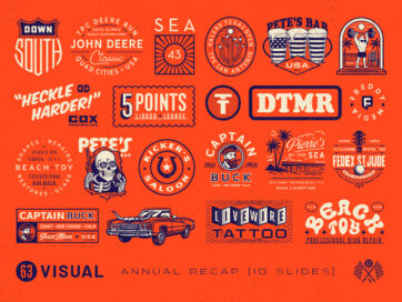
A Year of Logo Design, Illustration, and Brand Development at 63 Visual
Our annual recap has become a snapshot of where our studio is, how our craft is evolving, and the trust our clients continue to place in us. This past year marked the most logo and illustration heavy year in the…

63 Visual Creative Director Patrick Carter Interviewed by Voyage Magazine
Read the original interview on the Voyage Magazine website. Hi Patrick, please kick things off for us with an introduction to yourself and your story. I’m a proud lifelong Neptune Beach native, and I’m close to the Beaches community with…
GET IN TOUCH
GET IN TOUCH

Let’s Work Together
63 Visual Design Company
602 Shetter Avenue
Jacksonville Beach, Florida 32250
833.630.6363
info@63visual.com