 Menu
MenuGraphic Design Journal
A Kombucha Brand That Almost Was
Not every project makes it to market.
That’s something you learn quickly in the world of brand development. Ideas get momentum, concepts take shape, systems come together, and sometimes, for reasons outside the creative process, they stop short of becoming real.
But that doesn’t make the work any less valuable.
In fact, some of the most enjoyable, exploratory, and creatively fulfilling projects are the ones that never launch. They allow for freedom. They invite risk. They push boundaries without the weight of final production constraints.
This is one of those projects.
This was a fully realized brand concept for a kombucha beverage rooted in a unique cultural intersection, blending Turkish and Japanese influences into a cohesive identity system. It included not just one brand, but two: a premium flagship product and a more accessible, youthful sub-brand.
The product never came to fruition. But the work still stands as a strong example of strategic brand thinking, visual storytelling, and system-driven design.
The Concept: A Cross-Cultural Kombucha Brand
From the beginning, Okatora was built around a compelling narrative: a kombucha brand inspired by multiple cultural origins.
- Japan
- Turkey
- United States
The name translates loosely to “Hill Tiger,” a concept that immediately evokes strength, nature, and mystique. It’s a name that feels rooted in tradition but adaptable to a modern wellness product.
Kombucha itself already sits at the intersection of health and ritual. It’s natural, functional, and slightly unconventional. That made it the perfect canvas for a brand that could feel both refined and a little wild.
The goal was to build something that felt:
- Premium but not sterile
- Natural but not overly “hippie”
- Cultural without being cliché
- Sophisticated while still approachable
That balance drove every design decision.
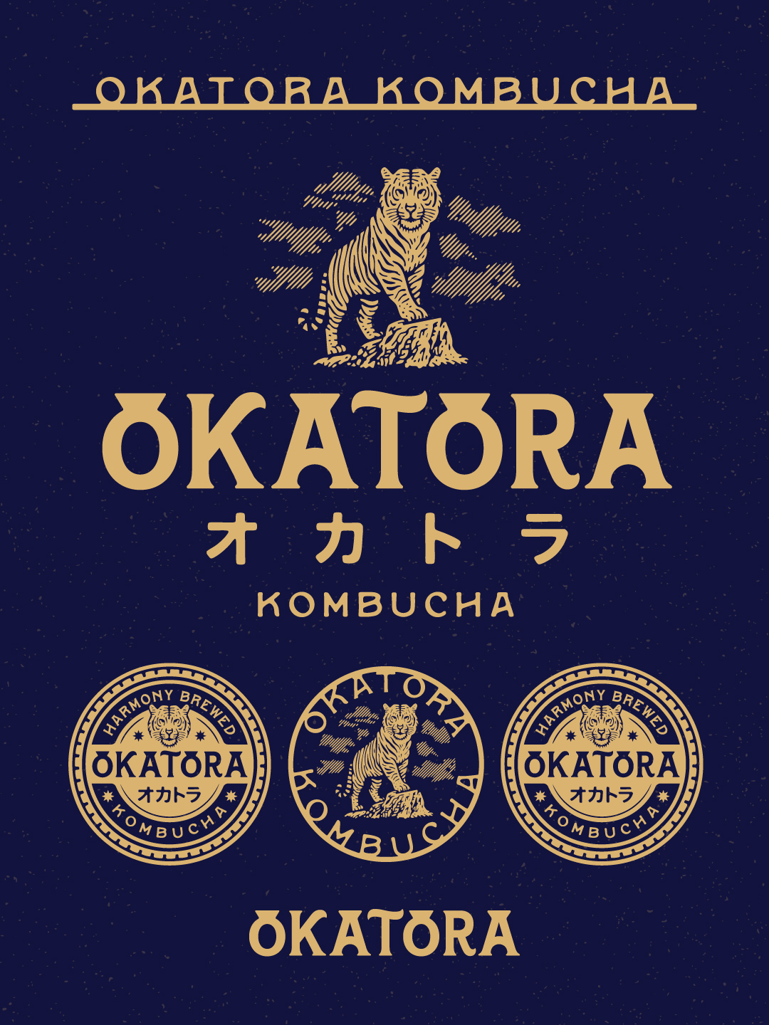
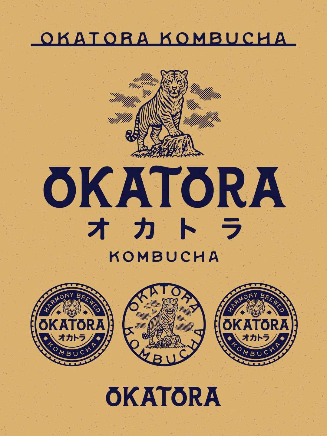
The Premium Flagship Brand
Okatora was positioned as the flagship product. A premium kombucha designed for a more refined audience.
Think glass bottles. Refrigerated. Clean ingredients. Elevated presentation.
Product Positioning
- Glass bottle (320ml and 1L formats)
- Refrigerated product
- Limited flavor variations (3–4 SKUs)
- Higher price point
Brand Tone
- Sophisticated
- Grounded
- Intentional
- Calm but confident
The visual identity leaned heavily into a vintage, illustrative style consistent with the 63 Visual aesthetic. Bold, single-color linework that translates cleanly across packaging, print, and merchandise.
At the center of the identity is the tiger.
Not an aggressive, roaring tiger, but a poised, grounded one. Standing on a rock. Calm, observant, confident. It reflects the idea of controlled strength and natural balance. Perfectly aligned with the kombucha category.
Visual System Highlights
- Engraving-style tiger illustration
- Serif-driven typography with strong character
- Subtle Japanese influence through katakana lettering
- Badge-style secondary marks for flexibility
- Limited, refined color palette (navy and gold, or inverted variants)
The system was designed to scale, from bottle labels to merchandise to retail displays, without losing its integrity.
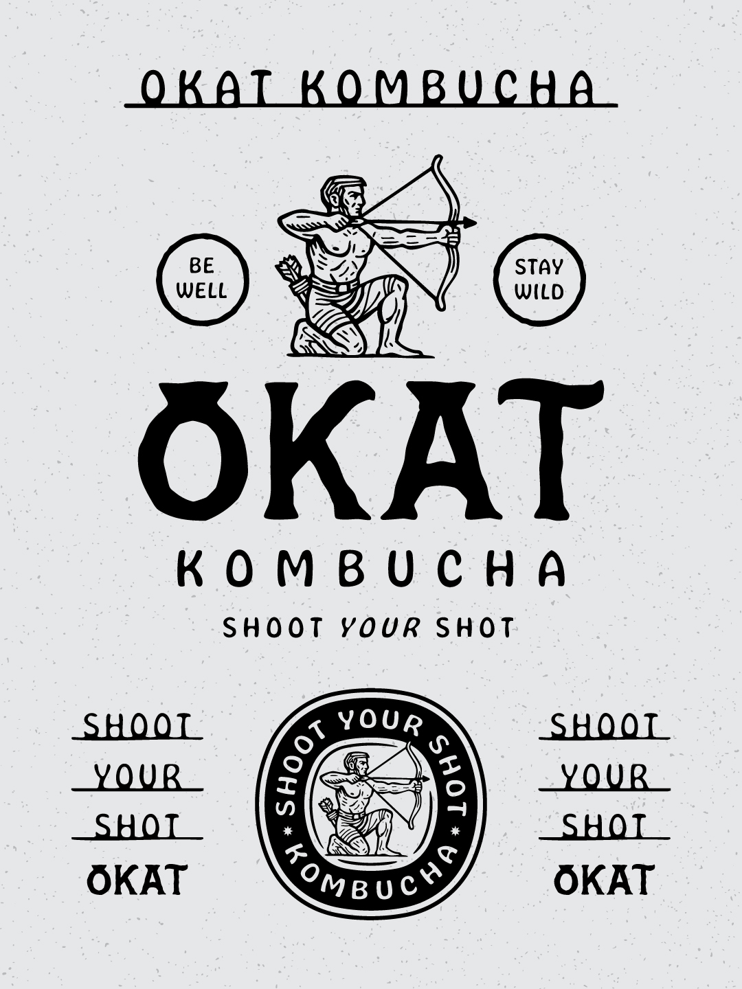
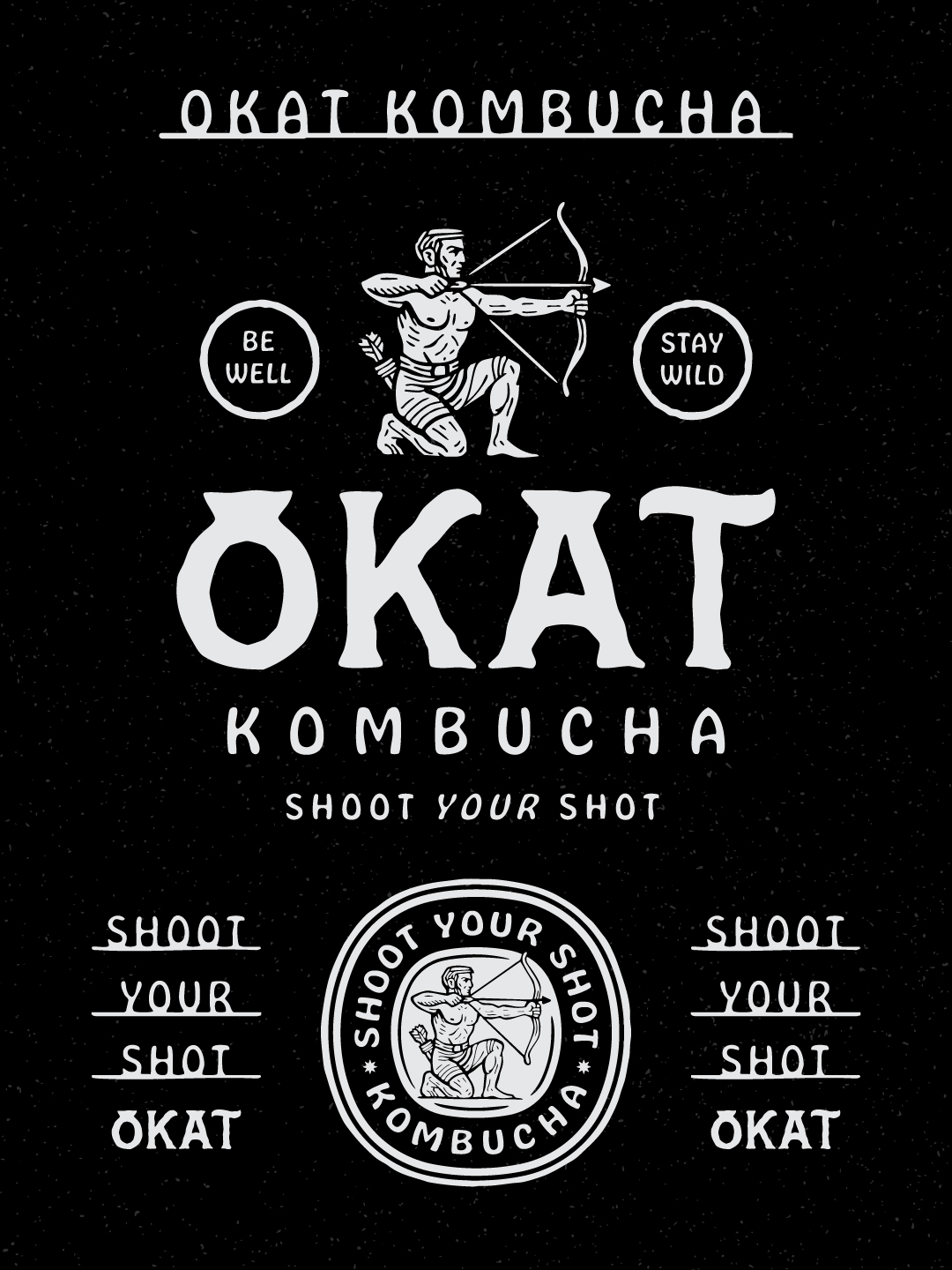
The Younger, More Accessible Sub-Brand
Alongside Okatora, a second brand emerged: OkAt.
Where Okatora is refined and premium, OkAt is loose, energetic, and more accessible.
Product Positioning
- Aluminum cans (320ml)
- Shelf-stable (no refrigeration required)
- More approachable price point
- Same flavor philosophy, broader appeal
Brand Tone
- Youthful
- Playful
- Slightly irreverent
- More “hippie,” in the best sense
The name OkAt comes from the Turkish phrase meaning “shoot arrow,” which led directly to the central visual motif: the archer.
Visual System Highlights
- Hand-drawn, imperfect typography
- Bold black-and-white execution
- Vintage illustration of a kneeling archer
- Supporting phrases like “Shoot Your Shot,” “Be Well,” and “Stay Wild”
- Badge-style marks for cans and merch
Compared to Okatora, the OkAt system intentionally loosens up. The lines are less rigid. The typography feels more spontaneous. The tone is more conversational.
But importantly, it still connects back to the parent brand.
The two systems feel related, but not identical.
That’s the key to a strong brand architecture.
Building a Cohesive Brand System
One of the most rewarding aspects of this project was developing a system that could support two distinct products without fragmenting the overall identity.
Too often, sub-brands either feel disconnected or overly constrained by the parent brand.
The goal here was to find the middle ground.
Shared DNA
- Hand-crafted, illustration-driven approach
- Vintage-inspired visual language
- Strong iconography (tiger vs. archer)
- Emphasis on wellness, nature, and vitality
Strategic Separation
- Okatora = premium, structured, refined
- OkAt = casual, expressive, youthful
This allowed each product to speak clearly to its audience while still feeling like part of the same world.
From a design standpoint, it’s a great exercise in restraint and flexibility at the same time.
Why Some Projects Don’t Launch
Here’s the reality: even strong concepts don’t always make it to market.
There are countless factors that influence whether a product launches:
- Manufacturing challenges
- Distribution logistics
- Financial considerations
- Timing and market conditions
- Internal business decisions
In this case, the project simply never moved forward.
And that’s okay.
Because the value of a project like this isn’t just in the final product—it’s in the process.
The Value of Work That Never Ships
Some of the most important creative growth happens in projects that never see the light of day.
Why?
- Explore ideas without restriction
- Refine your design instincts
- Build systems instead of just assets
- Experiment with tone, voice, and storytelling
- Push your style further
Okatora was one of those projects.
It reinforced the importance of building brands as systems—not just logos. It highlighted how cultural references can be woven together in a way that feels authentic rather than forced. And it provided an opportunity to create two distinct identities that still feel connected.
That’s the kind of work that carries forward into every future project.
Lessons from the Okatora Project
1. Strong Concepts Matter
The “Hill Tiger” and “Shoot Arrow” ideas weren’t just visual—they were conceptual anchors that guided the entire identity.
2. Brand Architecture Is Everything
Designing two brands simultaneously forces clarity. You have to define what belongs to each—and what connects them.
3. Simplicity Wins
Limiting color, focusing on strong illustration, and using intentional typography creates a system that’s both flexible and timeless.
4. Not Every Project Needs to Launch to Be Successful
Success in design isn’t always tied to market presence. Sometimes it’s about the quality of the thinking and execution.
Final Thoughts
Okatora Kombucha never made it to store shelves. There are no bottles, no cans, no retail displays. But the work is still meaningful. It represents a moment of creative exploration. A fully realized idea. A brand system that solved real problems and told a compelling story. And that’s what good design does, regardless of whether it ever becomes a product you can hold in your hand.
For us at 63 Visual, projects like this are a reminder that the process itself is worth it. Because every concept, every sketch, every system you build becomes part of a larger body of work—one that continues to evolve, refine, and inform everything that comes next.
If you’re building a brand, whether it’s launching tomorrow or still just an idea, we’d love to help bring it to life.

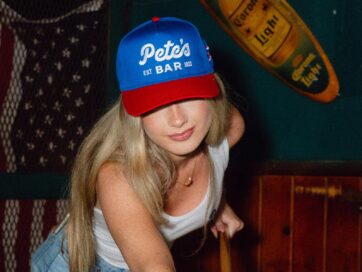
Celebrating America 250: 63 Visual Designs a Patriotic Merchandise Collection for Pete’s Bar in Neptune Beach
If you know the Jacksonville Beaches, you know there is no place quite like it on the Fourth of July. Around here, you could call it the unofficial 4th of July Capital of the World. This year marks 250 years…
Brand Development for 5 Points Liquor Lounge in Jacksonville, Florida
When the team behind 5 Points Liquor Lounge set out to create a new bar in the historic 5 Points area of Jacksonville, Florida, the goal was to develop a brand that felt established, relaxed, and full of character from…
Branding Bars, Restaurants, and Entertainment Venues: Strong Visual Identity Creates Memorable Experiences
A strong visual brand creates recognition, builds trust, shapes the customer experience, and ultimately drives revenue. When done correctly, branding becomes part of the atmosphere itself. It lives on the walls, in the menus, on the merchandise, and in the…
GET IN TOUCH
GET IN TOUCH

Let’s Work Together
63 Visual Design Company
602 Shetter Avenue
Jacksonville Beach, Florida 32250
833.630.6363
info@63visual.com