Graphic Design Journal

Tail-Wagging Charm with Barn Dog Packaging Design
With brand development, every project carries its own unique tale, and our recent project with the Barn Dog packaging design was no exception.
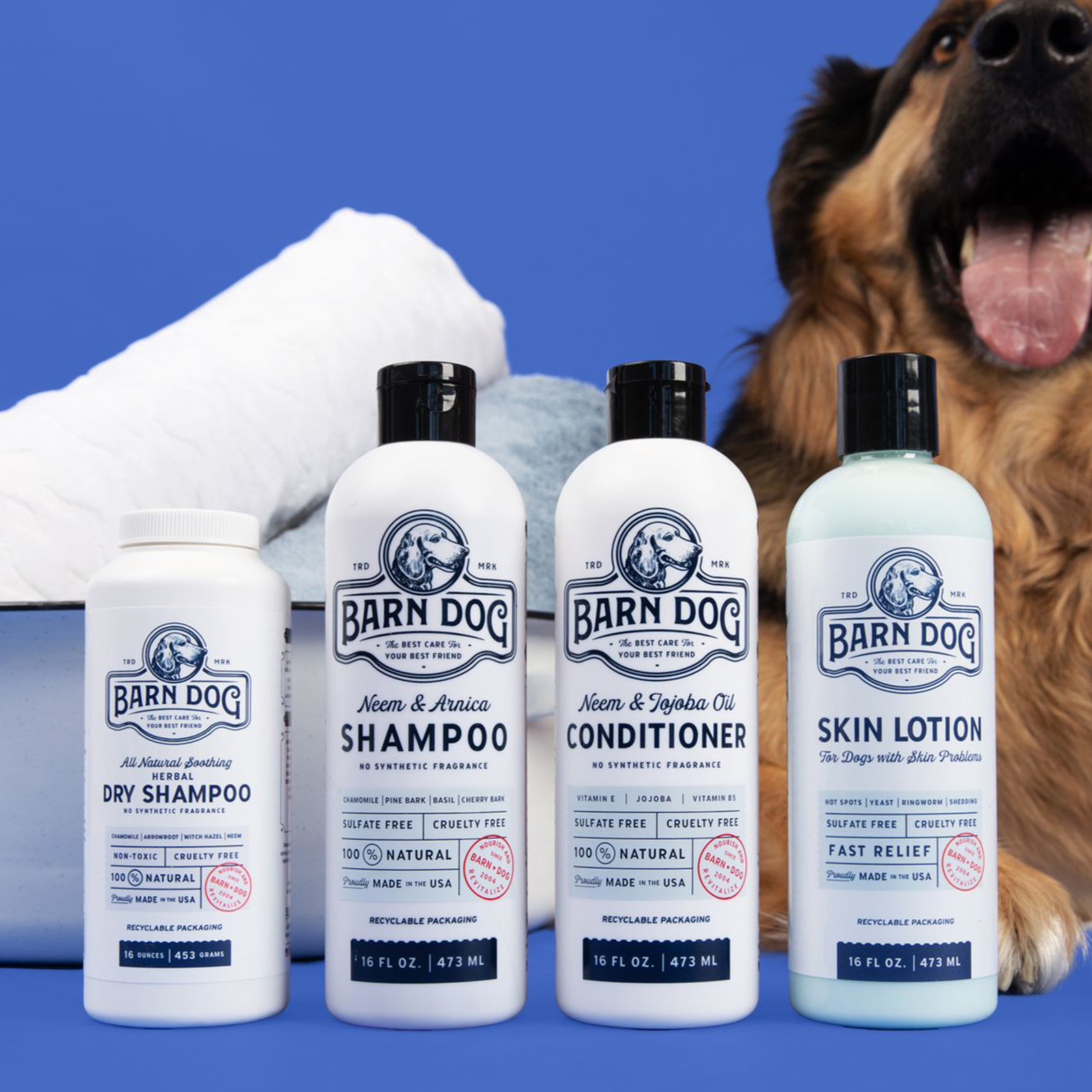
With classic charm and modern sophistication, the Barn Dog product line redefines pet care aesthetics, guided by the ethos of “The Best Care for Your Best Friend.” At 63 Visual, it’s important to infuse character and functionality into every design canvas we touch. With Barn Dog’s lineup of premium dog coat and skin care essentials – shampoo, conditioner, dry shampoo, and skin lotion – our mission was clear: to craft packaging that not only exuded elegance but also mirrored the purity of the all-natural and organic ingredients within.

The Design Concept
From the outset, our team drew inspiration from the rustic allure of traditional farms, where timeless craftsmanship is paired comforting embrace of nature. This essence was meticulously distilled into a design language that seamlessly blended classic elements with a contemporary twist, echoing Barn Dog’s commitment to both heritage and innovation.
The focal point of our design journey revolved around striking the delicate balance between eclecticism and simplicity. We envisioned packaging that would capture attention through its understated allure, inviting pet owners to indulge in a sensory experience that transcended the ordinary.

Print Process and Material Selection
To breathe life into our vision, we opted for a custom 2-color Pantone screen printing process on pristine white bottles. This crafted approach allowed us to infuse each bottle with a tactile allure, elevating the product from mere commodity to coveted artifact. The choice of materials was a reflection of Barn Dog’s unwavering dedication to quality and purity. Every bottle served as a testament to the brand’s commitment to harnessing the power of nature, with each ingredient thoughtfully curated to deliver the utmost care to beloved furry companions.

A Symphony of Cleanliness and Modern Flair
At the heart of Barn Dog’s packaging design lies a harmonious blend of cleanliness and modern flair. The crisp lines and uncluttered layout symbolize the pristine purity of the product, while subtle touches of eclectic charm pay homage to the brand’s rustic roots. The typography, with its timeless elegance and modern sensibility, serves as a beacon of sophistication, guiding consumers on a journey of discovery through Barn Dog’s exquisite offerings. Each element, from the illustrations to the minimalist color palette, harmonizes to create a visual symphony that resonates with pet owners seeking nothing but the best for their pets.

In Conclusion
As Barn Dog’s packaging design journey comes to fruition, we stand proud of the collaborative effort that brought this vision to life. In every bottle lies a testament to the seamless fusion of tradition and innovation, of elegance and functionality. At 63 Visual, we believe that great design transcends aesthetics; it tells a story, evokes emotions, and fosters connections. With Barn Dog, we’ve not only crafted packaging that delights the senses but also encapsulates the essence of a brand dedicated to providing “The Best Care for Your Best Friend.”

GET IN TOUCH
GET IN TOUCH

Let’s Work Together
63 Visual Design Company
602 Shetter Avenue
Jacksonville Beach, Florida 32250
833.630.6363
info@63visual.com

 Menu
Menu


