 Menu
MenuGraphic Design Journal
Atlanta’s Crowned Jewel: A Unified Restaurant Brand Identity for Rose & Crown
This featured project involved the brand development for Rose & Crown, a restaurant and social club located in Atlanta, Georgia.
This establishment is a unique blend of three distinct experiences: Rose & Crown Tavern, R&C Kitchen, and The Crown Club. Each of these segments offers a different ambiance and service, and our task was to develop a cohesive brand system that encapsulates the elegance and excellence of the entire venue.
The Concept
Rose & Crown in Atlanta is a multi-faceted establishment designed to cater to a diverse clientele. The Rose & Crown Tavern serves as a casual bar and restaurant, R&C Kitchen provides an upscale dining experience, and The Crown Club is an exclusive private social club. Although each segment has its own unique personality, they all share the same core values of sophistication, quality, and a commitment to providing an exceptional experience.
Our challenge was to design three distinct logo systems that would represent each segment individually while maintaining a unified brand identity across all three. The logos needed to be visually connected, using a consistent color palette and stylistic elements, yet still reflect the unique character of each part of the establishment.
The Design Process
We began by exploring the essence of what each segment represents. The goal was to create logos that would resonate with the target audience and reflect the upscale nature of the establishment. The color palette was chosen carefully to evoke a sense of luxury and elegance, with dark, rich tones that tie the three logos together.
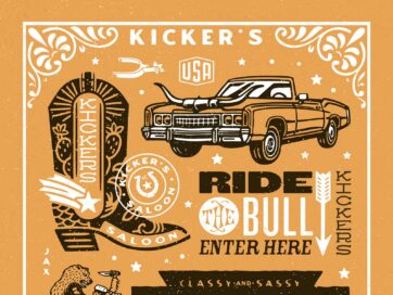
Rose & Crown Tavern
For the Rose & Crown Tavern, we wanted to capture the charm of a classic tavern while incorporating modern design elements that would appeal to a contemporary audience. The logo features a stylized crown intertwined with a rose, symbolizing both the heritage and the vibrant atmosphere of the tavern. The typography is warm and inviting, designed to make guests feel comfortable as soon as they walk in.
![]()
R&C Kitchen
R&C Kitchen, as the more refined dining option, required a logo that exudes sophistication. We developed a minimalist typographic design that highlights the elegance of the dining experience. The logo is centered around a sleek monogram of “R&C” enclosed within a simple, yet refined frame. The use of clean lines and understated embellishments reflects the high standards of the cuisine and service at R&C Kitchen. The subtle use of gold in the color palette adds a touch of luxury.
![]()
The Crown Club
The Crown Club is the epitome of exclusivity and prestige within the Rose & Crown establishment. For this logo, we designed an ornate typographic emblem featuring a simple “C” monogram with a geometric enclosure, representing the club’s elite status. The typography is bold and stately, chosen to reflect the club’s focus on providing a premium, members-only experience. This logo was designed to stand out as a symbol of the club’s distinguished reputation, while still being clearly related to the other two logos through shared stylistic elements.
![]()
The Final Brand System
The result of our work is a cohesive brand system that elegantly ties together the three segments of Rose & Crown. Each logo is distinct, reflecting the unique character of its respective segment, yet they all share a common visual language that makes them instantly recognizable as part of the Rose & Crown family.
The consistent use of color, typography, and design motifs across all three logos ensures that whether a guest is enjoying a casual meal at the Rose & Crown Tavern, indulging in a fine dining experience at R&C Kitchen, or mingling in the exclusive atmosphere of The Crown Club, they are always engaging with a brand that exudes sophistication and quality.
The Art of Crafting Brand Cohesion
At 63 Visual, we believe that a well-crafted brand identity is essential to the success of any business. The project for Rose & Crown in Atlanta is a perfect example of how thoughtful design can unify diverse elements under one powerful brand. We are proud of the work we have done in creating a brand system that not only reflects the elegance and excellence of the establishment but also enhances the overall experience for its guests. We look forward to seeing how Rose & Crown continues to thrive and make its mark on Atlanta’s dining and social scene.

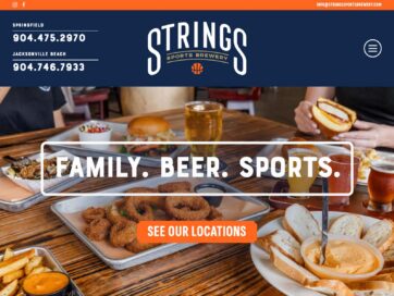
Branding Bars, Restaurants, and Entertainment Venues: Strong Visual Identity Creates Memorable Experiences
A strong visual brand creates recognition, builds trust, shapes the customer experience, and ultimately drives revenue. When done correctly, branding becomes part of the atmosphere itself. It lives on the walls, in the menus, on the merchandise, and in the…
The Importance of Visual Brand Development in Website Design
Effective website design is closely tied to strong brand identity. A thoughtful combination of logo design, color palette, typography, imagery, and layout creates a cohesive experience that communicates professionalism and builds trust. When these elements work together, a website becomes…

Brand Design for Adam Wardziński’s 2026 Octopus Butterfly U.S. Tour
Working with Adam Wardziński (@wardziak_bjj) on the brand design for his 2026 Octopus Butterfly U.S. Tour was one of those moments. As longtime fans of Adam’s jiu jitsu and his technical mastery of the butterfly guard, this project was already…
GET IN TOUCH
GET IN TOUCH
Let’s Work Together
63 Visual Design Company
602 Shetter Avenue
Jacksonville Beach, Florida 32250
833.630.6363
info@63visual.com