Graphic Design Journal
An Animated Approach to Brand Identity Design
Located in Downtown Jacksonville, Toon Town is an exciting and spacious event facility and indoor pickleball center that's truly one-of-a-kind.
Featuring a blend of event space, tailgating, pickleball courts, and a pizzeria, this massive establishment is wrapped from wall to wall in creative graffiti, all with a nostalgic cartoon theme. Designing the logo and brand identity for Toon Town was a fun journey, and we’re excited to share the details with you.
Capturing the Spirit of Toon Town Jacksonville
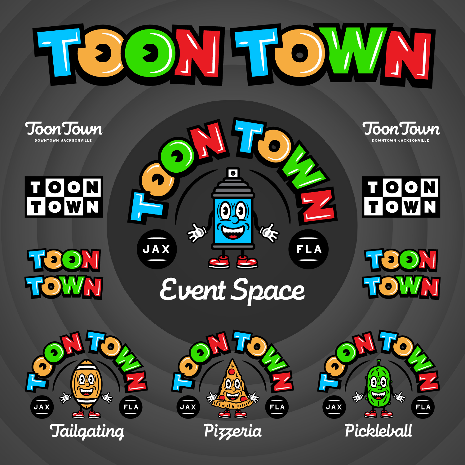
Toon Town is a full experience. Our goal was to encapsulate the playful, energetic, and creative spirit of Toon Town in a logo package that speaks to its diverse offerings. The facility’s unique blend of activities required a logo set that could represent each segment while maintaining a cohesive and consistent look. Here’s how we approached this multifaceted challenge:
Four Segments, One Vibrant Identity
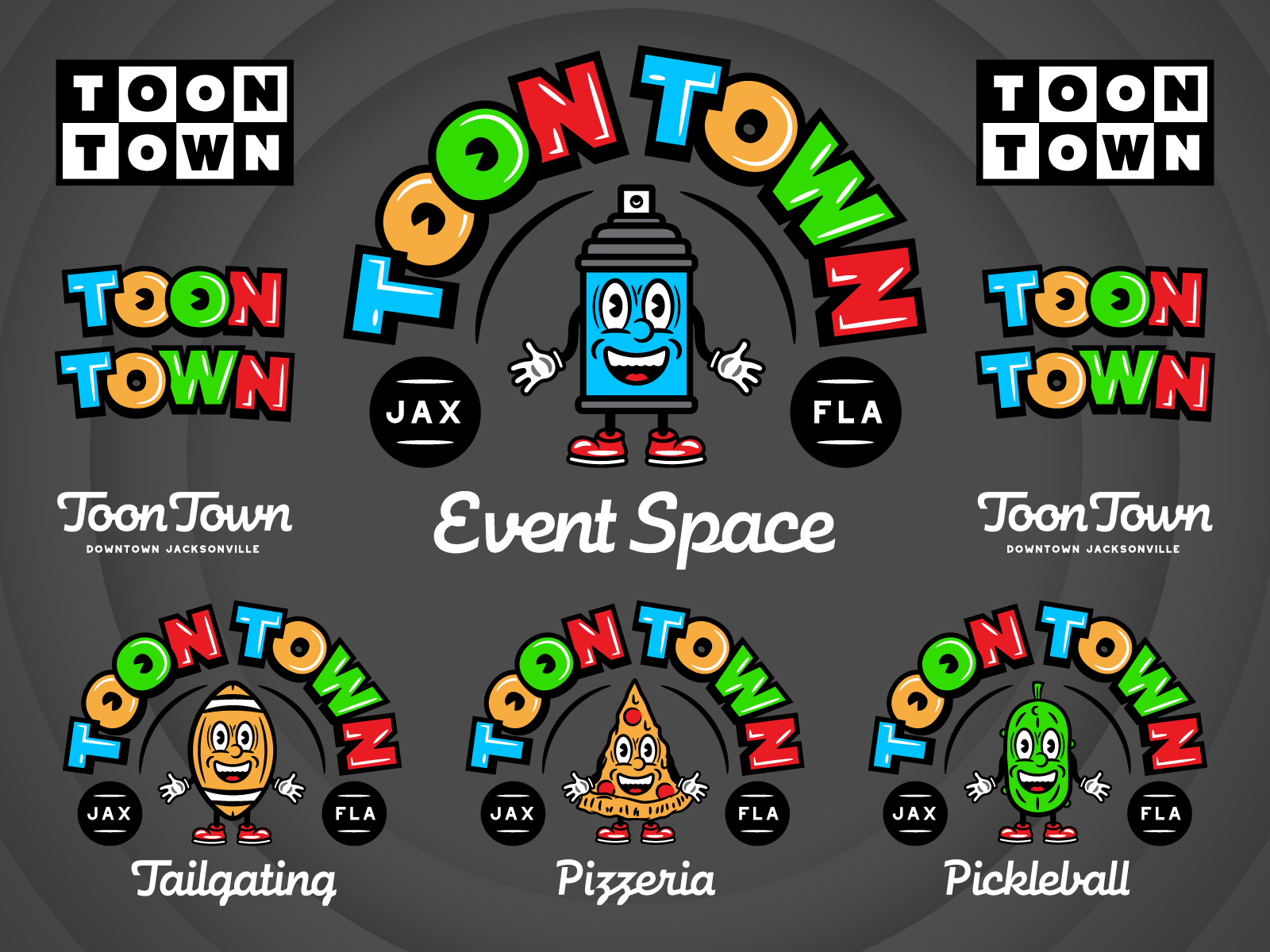
To bring Toon Town’s various services to life, we created custom illustrated cartoon characters for each of the four main segments:
Event Space: A spray paint can to highlight the character of the space
Tailgating: A football to capture the excitement of sports tailgating
Pickleball: A pickle to embody the casual fun of indoor pickleball.
Pizzeria: A cheerful pizza man to showcase joy of delicious food and good times.
Each character was carefully crafted to reflect the unique vibe of its respective segment, ensuring that every aspect of Toon Town’s services is vividly represented.

Handcrafted Cartoon Typography
Typography plays a crucial role in logo design, especially for a brand as lively as Toon Town. We developed a custom typeface in a cartoon style, harmonizing perfectly with the illustrated characters. The handcrafted typography not only enhances the playful aesthetic but also ensures that the logo is instantly recognizable and memorable.

The Design Process
Our design process began with in-depth research and brainstorming sessions to understand the essence of Toon Town. We collaborated closely with the Toon Town team to ensure that every element of the logo resonated with their vision and the atmosphere of their facility. Here’s a glimpse into our creative process:
Concept Development: We sketched multiple concepts for each segment, exploring different styles and character designs. This phase was all about capturing the right energy and personality for each aspect of the business.
Character Illustration: Once we settled on the best concepts, we brought the characters to life with vibrant colors and expressive features. Each character was designed to be engaging and instantly relatable.
Typography Creation: We custom crafted the cartoon-style typeface, ensuring that it complemented the characters while standing out on its own. The typography needed to be bold, fun, and versatile for various branding materials.
Refinement and Feedback: We refined the designs based on feedback from the Toon Town team, ensuring that every detail was perfect. This collaborative approach ensured that the final logo package was a true reflection of Toon Town’s brand.
The Result: A Logo That Showcases the Fun and Excitement of Toon Town.

The final logo package for Toon Town is a vibrant, cohesive representation of its diverse offerings. Each illustrated character and the custom typography work together to create a brand identity that is as unique and lively as the facility itself. The logo is versatile enough to be used across various mediums, from signage and merchandise to digital platforms and print materials.

Conclusion
The Toon Town logo tells a story of fun, creativity, and community. It’s a testament to what makes Toon Town special and a symbol of the unforgettable experiences it offers. We’re excited to see how this brand identity helps Toon Town Jacksonville connect with their audience. If you’re in Downtown Jacksonville, be sure to visit Toon Town and experience the magic for yourself. And if your brand needs a creative boost, reach out to us at 63 Visual. Let’s create something amazing together!
Ready to elevate your brand? Contact us at 63 Visual and let’s bring your vision to life.

GET IN TOUCH
GET IN TOUCH

Let’s Work Together
63 Visual Design Company
602 Shetter Avenue
Jacksonville Beach, Florida 32250
833.630.6363
info@63visual.com

 Menu
Menu
